


 Shopify Development
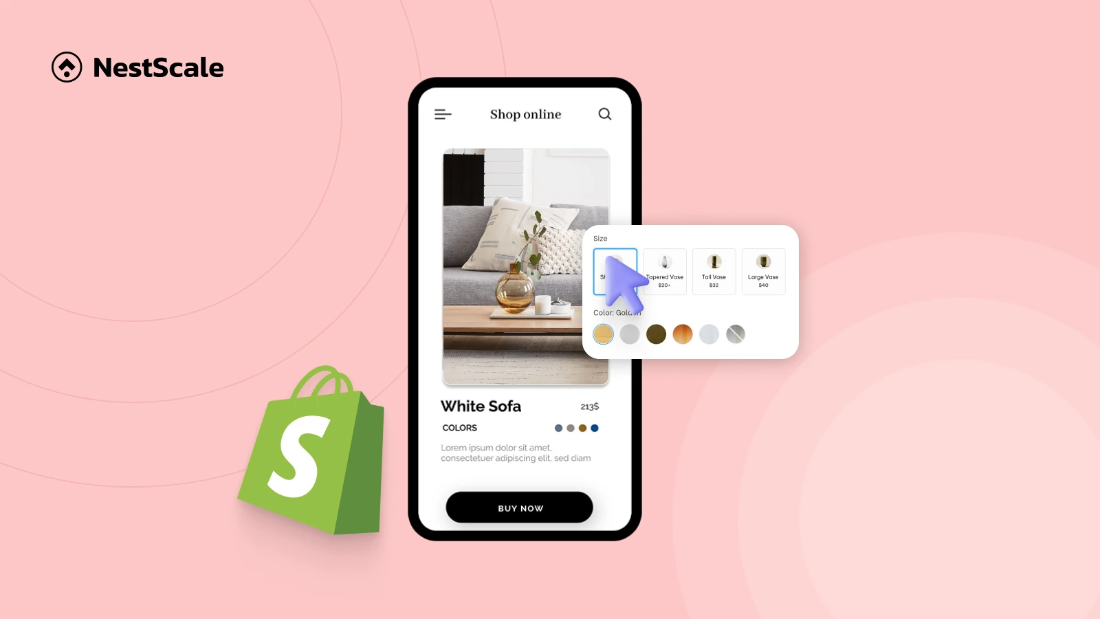
Optimizing your color swatches and variant images mobile-friendly in shopify is crucial for driving sales and enhancing customer satisfaction. With over 70% of e-commerce traffic now originating from mobile devices, having clear and responsive visuals ensures shoppers can easily explore product variations, improving their buying experience and boosting your brand’s credibility. In this blog, we’ll share practical insights and step-by-step methods to effectively optimize your store’s color swatches and variant images for mobile.
Why do mobile-friendly swatches and variant images matter?
A study shows that about 85% of consumers base purchases on color. When those color options are presented in a clear, mobile-friendly format, like tappable swatches that instantly show what the product looks like in different variations, decision-making becomes easier and faster. Color swatches help reduce decision time ad lower cart abandonment by simplifying variant choices. Shopify and analytics experts confirm that stores using optimized swatches see higher user satisfaction, which translates directly into more sales.
Mobile optimization for your swatches and variant images significantly impacts user experience and conversions:
- Frustration-free UX: Small, unoptimized swatches frustrate mobile users, leading to page exits and abandoned carts.
- Better page performance: Large, uncompressed images slow down page load times, especially on mobile connections, which can lead to lost sales.
- SEO ranking advantage: Google prioritizes mobile-optimized content, so responsive visuals help improve search visibility.
- Higher conversion rates: Clear, responsive visuals allow users to explore product options quickly and confidently, increasing purchase intent.
Step-by-Step Guide: Optimizing Shopify color swatches and variant images for mobile
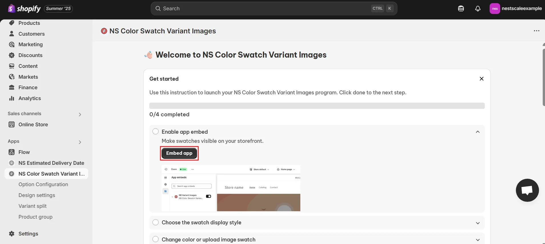
Step 1: Install and Activate NS Color Swatch Variant Images
First, you’ll need the right tool to display swatches effectively:
1. Navigate to the Shopify App Store and search for “NS Color Swatch Variant Images.”
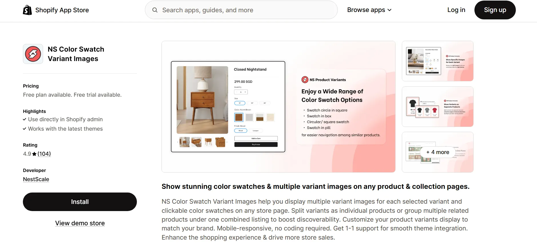
2. Click to install the app, and then access it through your Shopify admin panel.
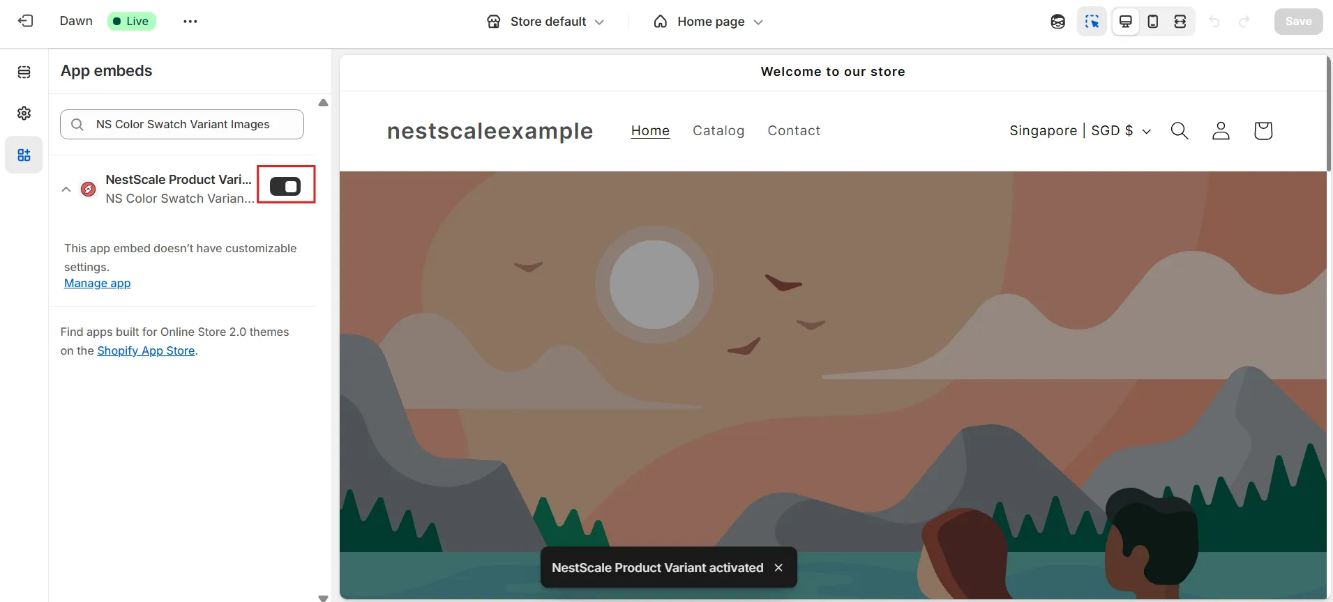
3. Follow the provided “Get Started” guide, select “Embed app,” and activate it via the Shopify theme editor by toggling the switch and saving your changes.
4. You’ll be redirected to the Shopify theme editor, just toggle ON the switch beside the app name, then hit Save.
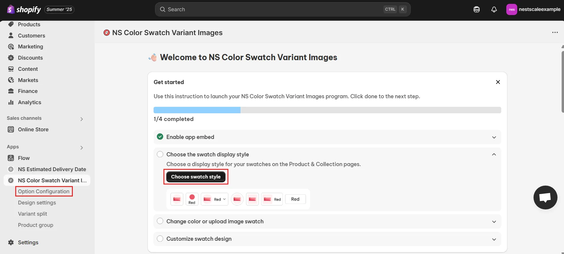
Step 2: Configure Your Swatches for Mobile Display
Once activated, let’s set up your color swatches clearly for mobile users:
1. From the app’s dashboard, click either “Choose Swatch Style” or go directly to “Option Configuration.”
2. Select specific products or multiple products from your product list to apply swatches.
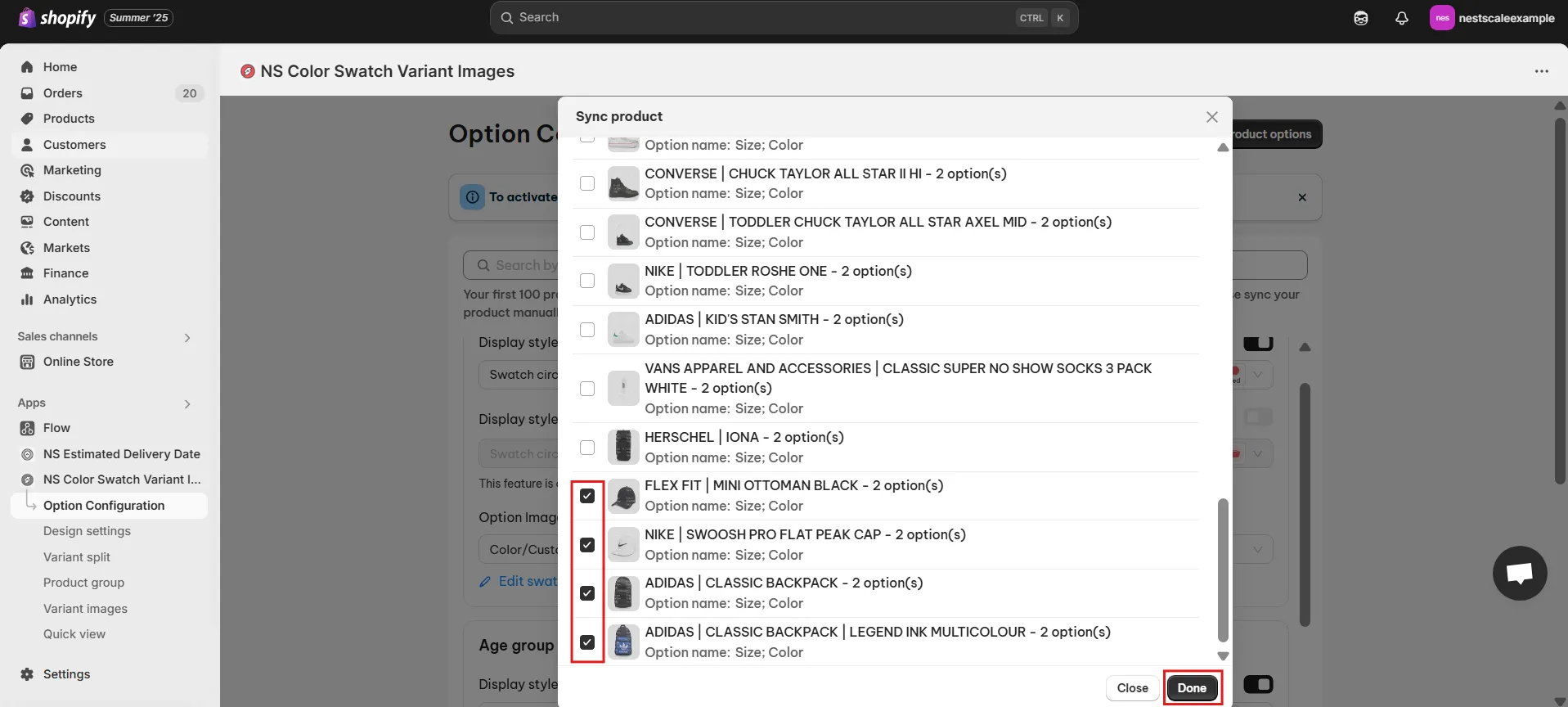
3. Enable the toggles for “Display Style on Product Page” and “Display Style on Collection Page” to ensure swatches appear clearly on both types of pages.
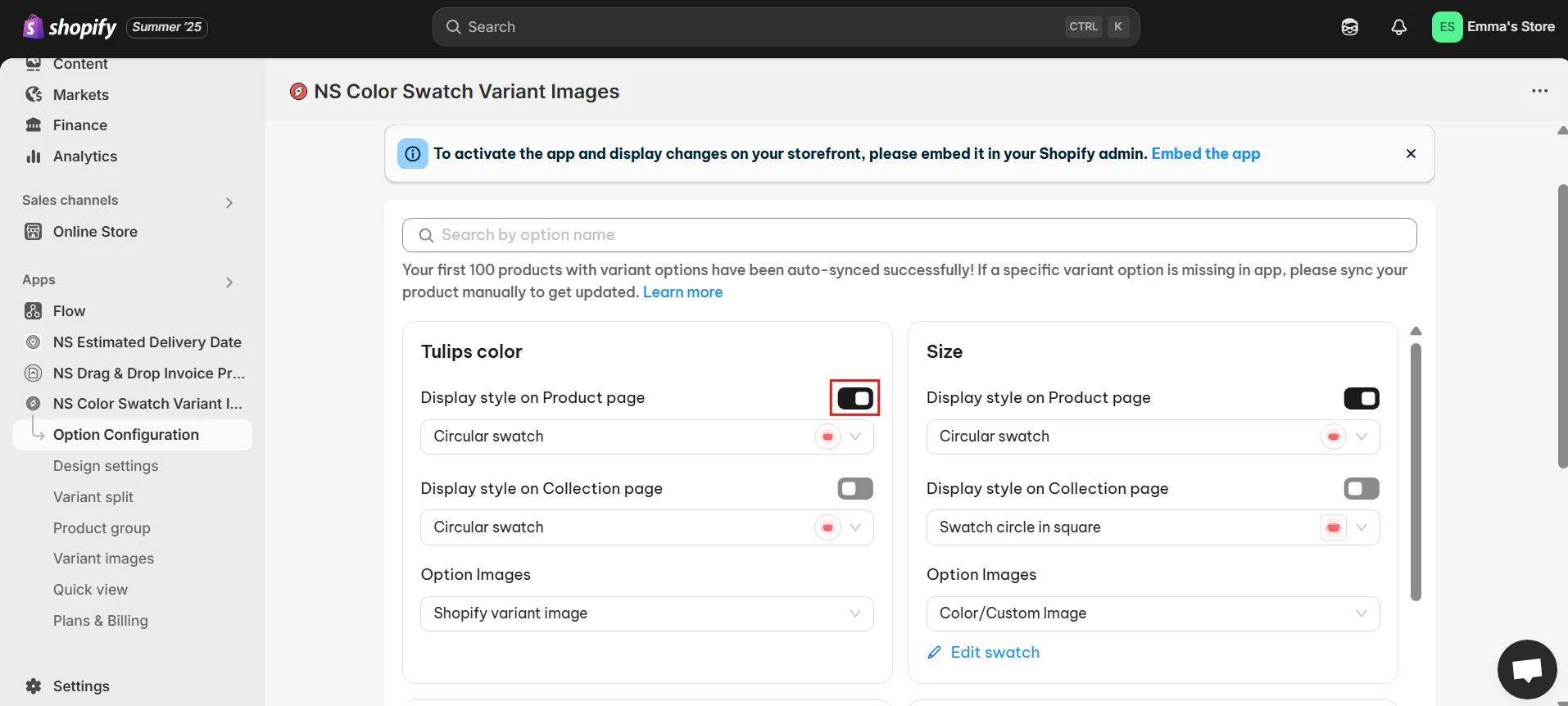
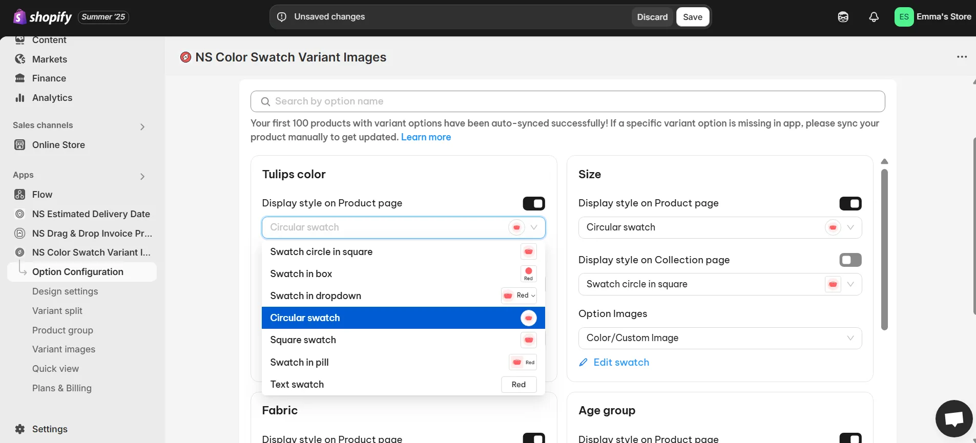
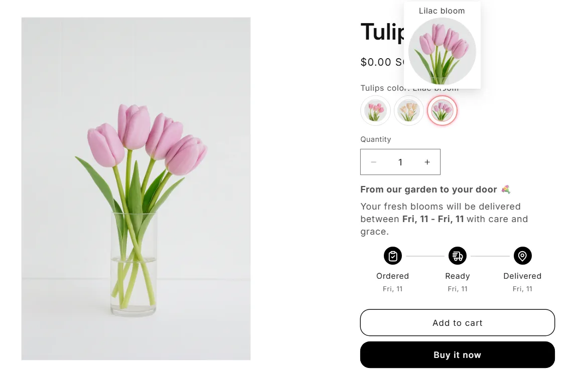
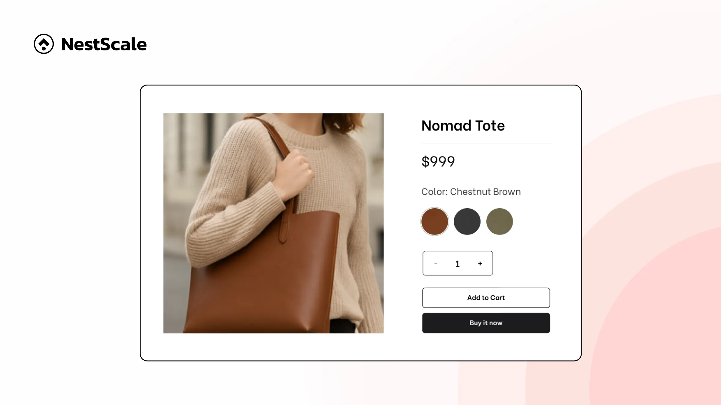
4. Choose a mobile-friendly swatch shape like circles or squares for easier touch interactions.
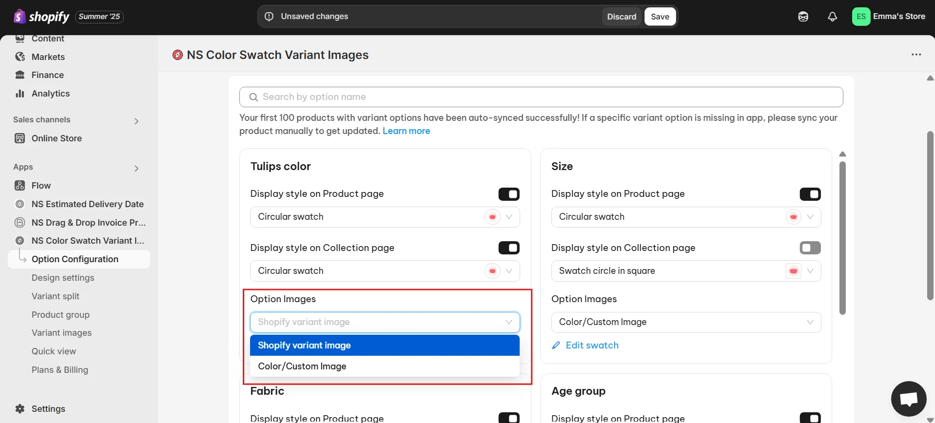
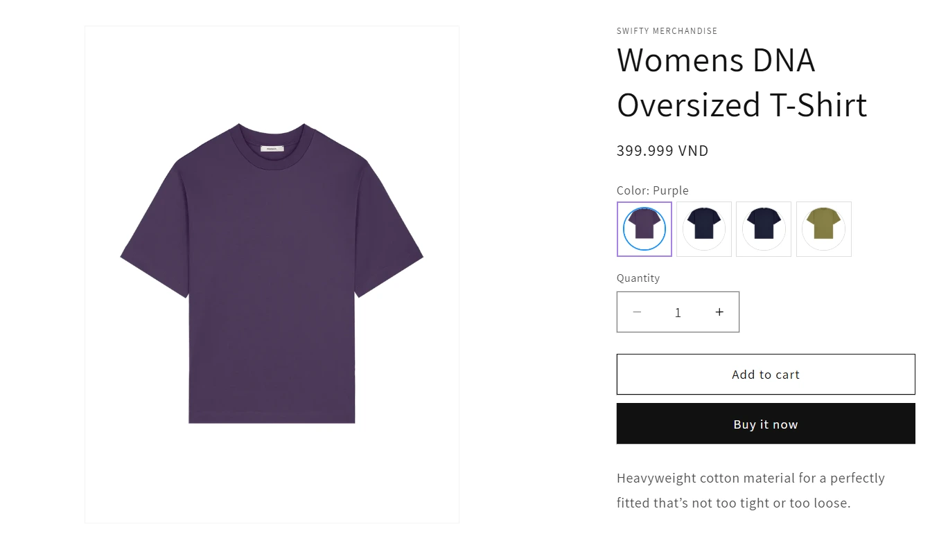
5. Decide if you’ll utilize existing Shopify variant images or create new custom images:
- Select your current Shopify variant images.
- Or create custom visuals using the color picker, HEX codes, or upload your own images.
6. Assign appropriate images or colors to each variant clearly, then click “Done” and save your setup.
Step 3: Customize Swatch Appearance for Optimal Mobile UX
Make your mobile swatches visually appealing and user-friendly:
1. Open “Design Settings” within the app.
2. Customize swatches separately for Product and Collection Pages or uniformly for both.
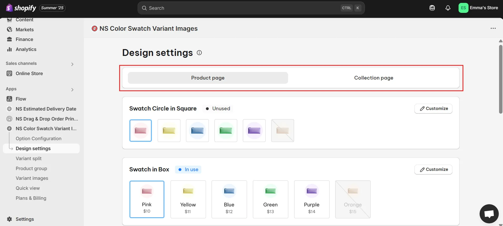
3. Adjust settings to improve the mobile experience:
With NS Color Swatch Variant Images, the size of swatches and variant images is optimized for both desktop and mobile by default. However, you can still customize how they appear on your store using the app’s design and display settings
General Settings: Optimize swatch size, spacing, and border thickness for mobile touchscreens.
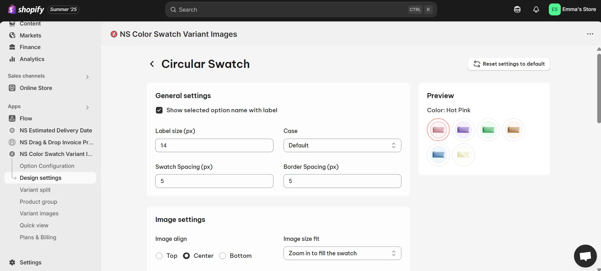
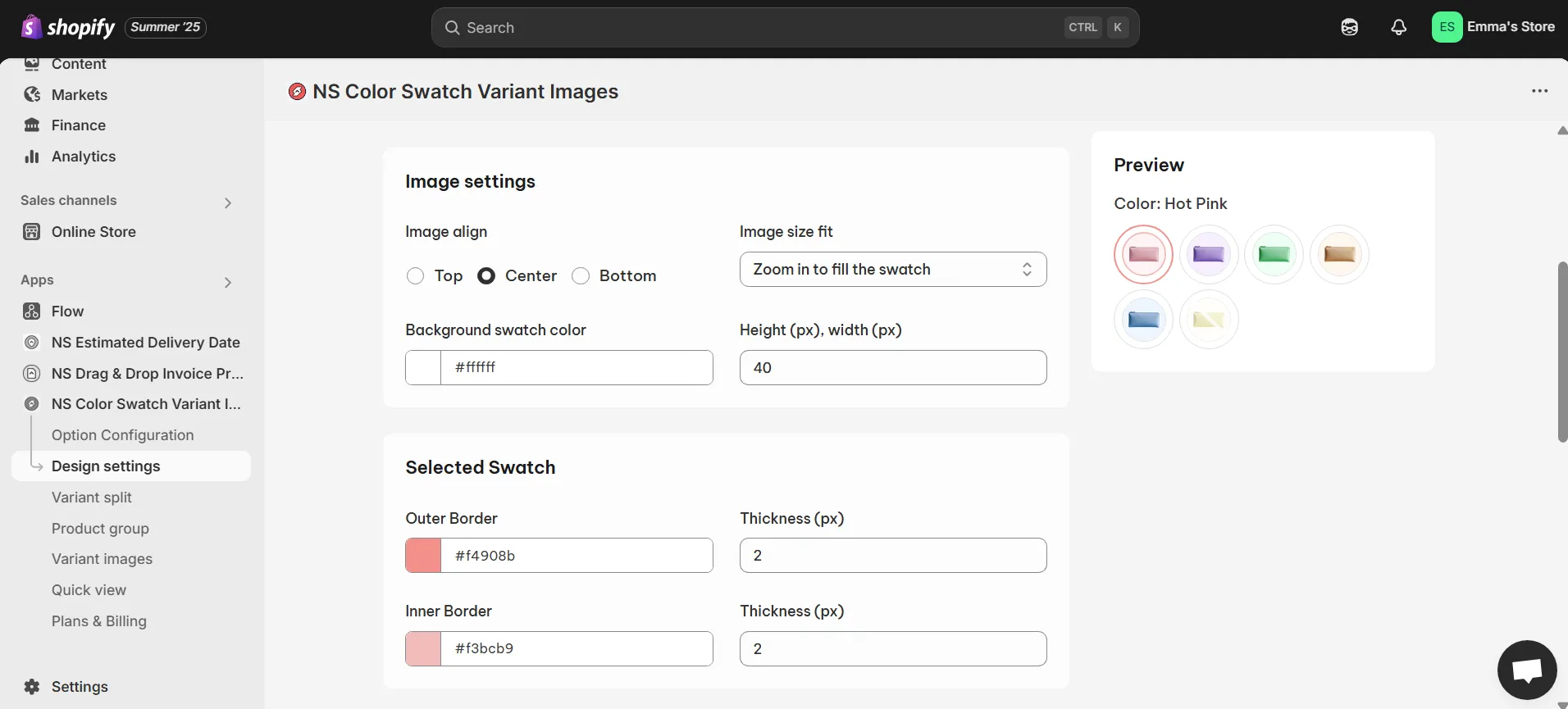
Image Settings: Enable smooth interaction behaviors like zoom or hover effects.
Selected & Unselected Swatch: Clearly differentiate selected and unselected variants.
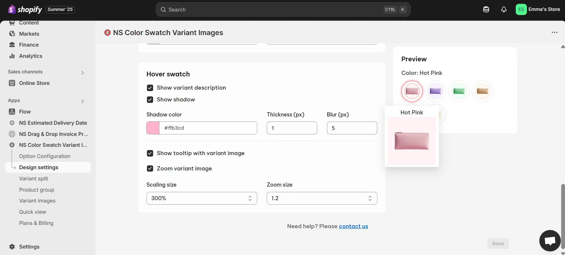
Hover Effects: Add interactive elements such as tooltips and subtle shadows for visual clarity.
4. Test your changes thoroughly using the Preview Panel before saving.
Bonus Tips for Enhancing Mobile UX with NS Color Swatch Variant Images
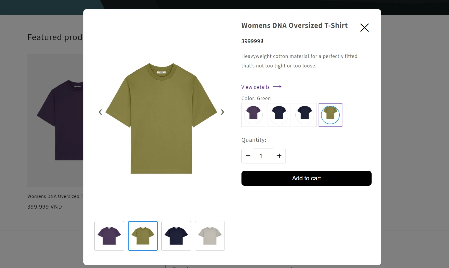
Enhance your mobile shopping experience further by leveraging standout features from NS Color Swatch Variant Images. The Quick View feature, for instance, allows customers to swiftly preview essential product details, such as color choices and variant images, directly from the collection pages, eliminating the need to navigate away to individual product pages. This streamlined process helps shoppers easily and quickly find the variant they prefer, significantly improving their overall experience.
Additionally, the app offers customizable hover effects, where you can display variant names, apply subtle shadows, activate informative tooltips, or enable image zoom functionality. These interactive features create an engaging and polished browsing experience, prompting customers to interact more intuitively with your products.
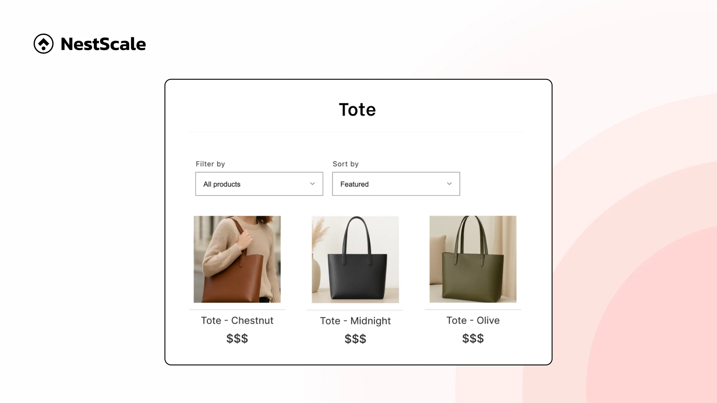
Another valuable capability is the flexibility to either display variants as separate products or combine multiple variants into a single listing. Showing variants individually is particularly effective for visually driven categories like fashion and cosmetics, where customers typically browse by distinct colors, patterns, or styles. Conversely, combining listings into one comprehensive product page simplifies navigation, making it convenient for users to explore multiple options without repeatedly switching pages.
These features collectively ensure your Shopify store delivers a superior and engaging mobile shopping experience, helping to drive conversions and customer satisfaction.
FAQs
Why do my color swatches look fine on desktop but not on mobile?
Mobile-specific issues like overlapping elements or hidden swatches are often caused by theme limitations or non-optimized images. NS Color Swatch Variant Images is designed to prevent this by offering mobile-friendly layout settings and design customization for both product and collection pages.
Can I customize the size and shape of color swatches for mobile?
Yes! With NS Color Swatch Variant Images, you can easily adjust swatch shape (circle, square, pill), size, spacing, and even border styling, ensuring they’re both visually appealing and tap-friendly on smaller screens.
Why isn’t my swatch or variant image displaying properly on mobile?
Common reasons include mismatched image filenames, incorrect variant mapping, or outdated app settings. NS Color Swatch Variant Images syncs variant names with image files automatically, and its preview tool helps you check mobile appearance in real time.


 TikTok Advertising
  Google Advertising