

If you want to see for yourself what a regular visitor experience on your website, you need a heatmap.
However, to analyze customer behavior and take actions, you first need to know what the different colors and elements on the heatmap represent.
Let us break down exactly how to read a heat map so you can start improving your store performance!
1. The basics: How to read a heat map
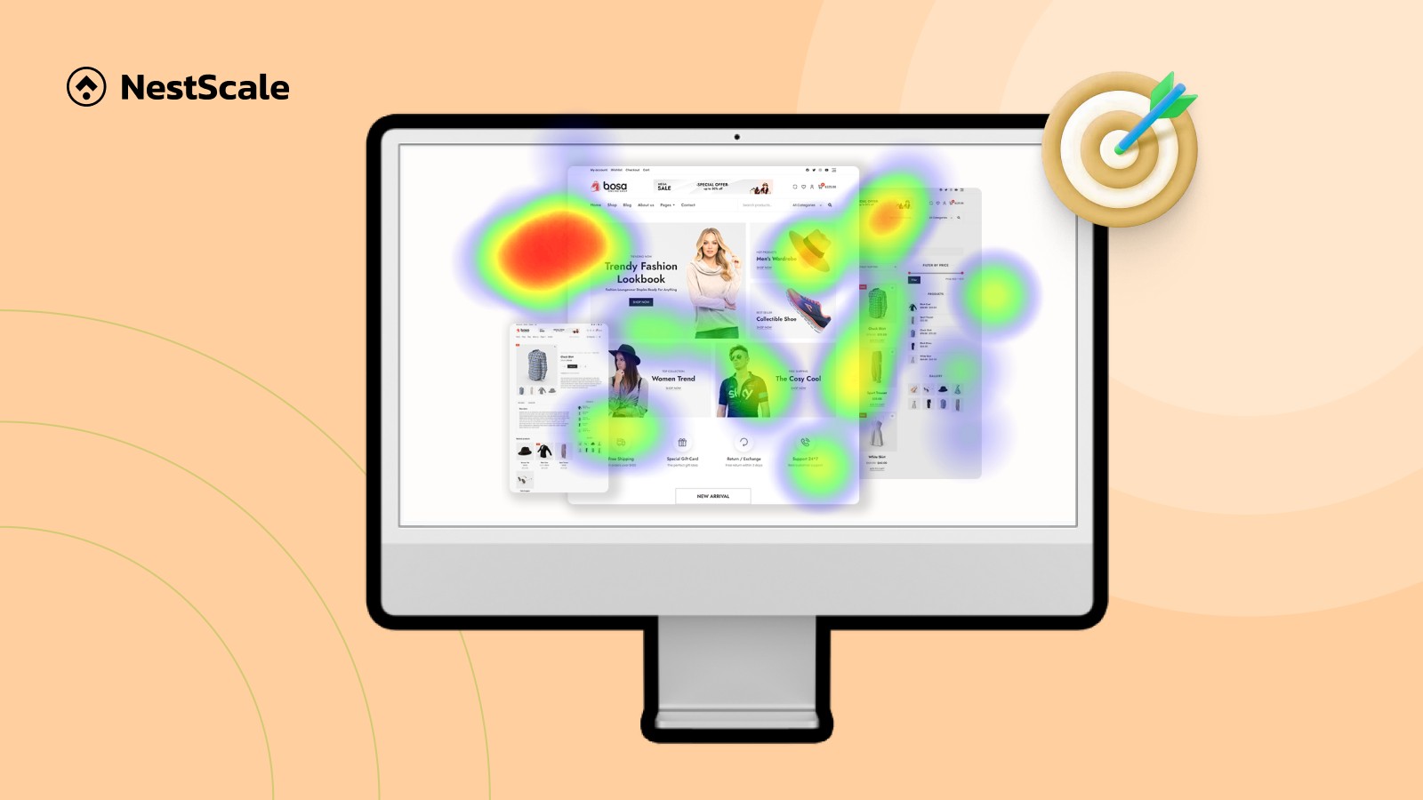
At its core, a heatmap is a colored layer that sits on top of your website pages. It visualizes user behavior (often including clicks, scroll, and mouse movement) by a spectrum of color.
Imagine these colors like temperature. The color scale follows a simple rule: hot colors mean high activity, and cool colors mean low activity.
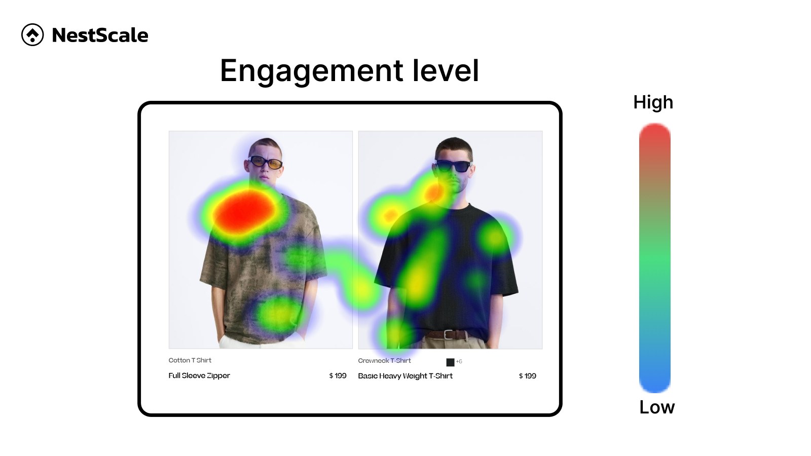
Bright red and orange areas are your website hotspots. These are the exact zones where your visitors are clicking, hovering, or looking the most.
As the color shifts down the spectrum into yellow and green, activity drops. Finally, deep blue and violet zones represent cold areas where visitors are showing little to no engagement.
If an area has no color overlay at all, it means your visitors are completely ignoring it.
While different heatmap apps can have different color codes, the above is the general color scale.
Now, the actual heatmap analysis is not as simple, and the same color can have different meanings. Let’s take a look at some common types of heatmaps, and what it means for store optimization.
2. Understanding common types of heatmaps
There are three primary types of heatmaps as below:
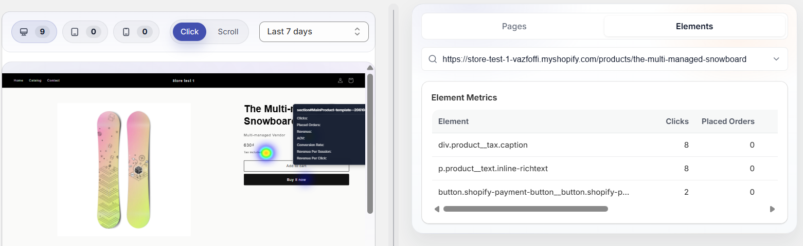
2.1. Click Heatmaps
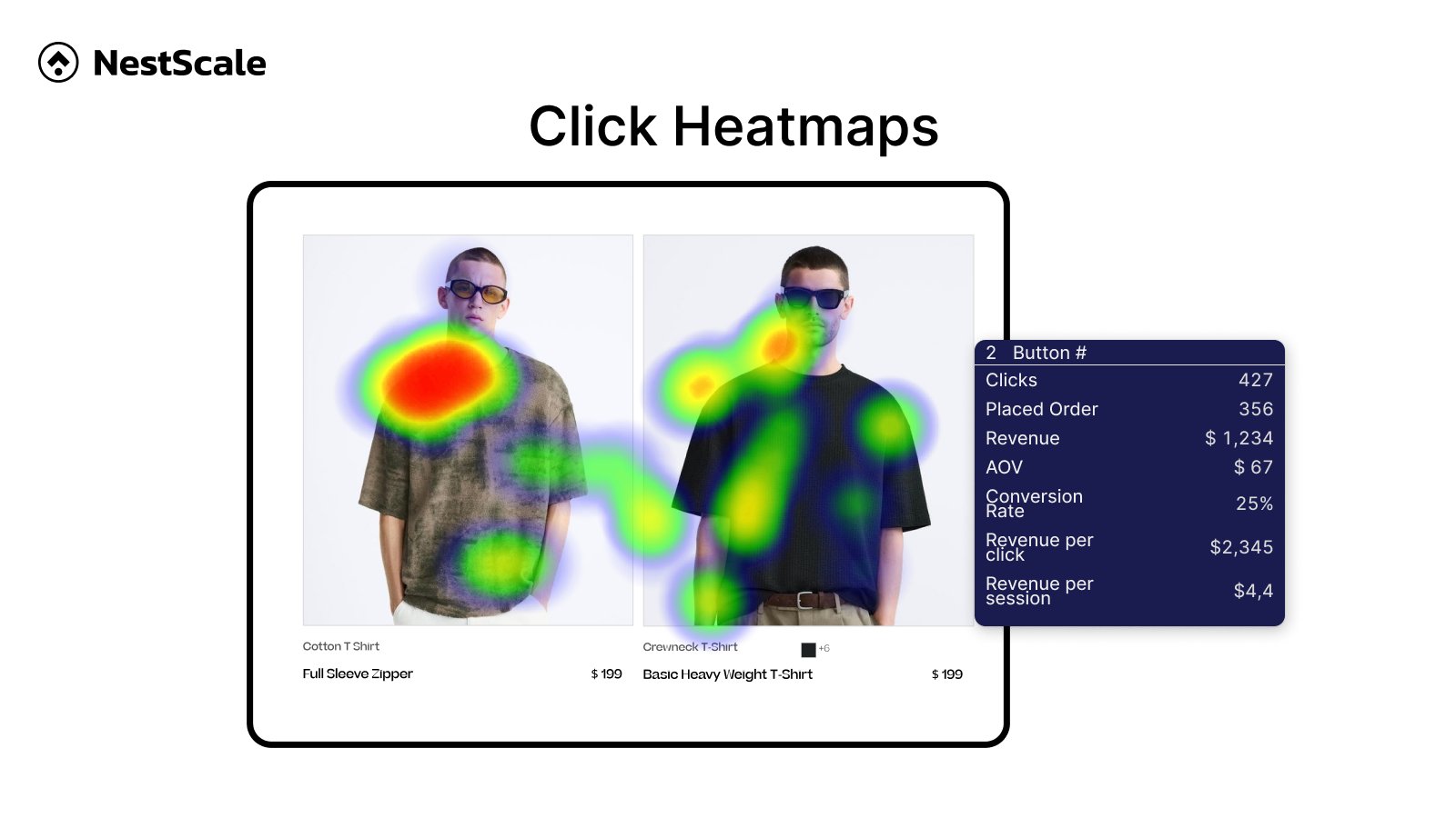
A click map displays aggregated data of every single click on a desktop or tap on a mobile device. Hotspots show you the links, buttons, and images that receive the most interaction.
For a merchant, this map is your primary tool to see if users are actually clicking your purchase buttons or getting distracted by non-essential links. Merchants also use this map to spot “dead clicks” where buyers are trying to interact with static, unlinked graphics.
2.2. Scroll Heatmaps
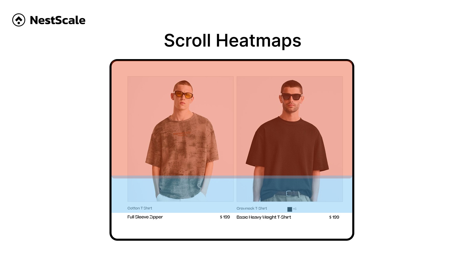
A scroll map shows the exact percentage of visitors who scroll down to specific points on your page. The top of your page will always be bright red because 100% of users see it when the page loads.
As you look lower, the colors transition toward blue. This map reveals your average drop off point, telling you if your critical text or product details are buried too deep where nobody sees them.
2.3. Mouse Movement Maps
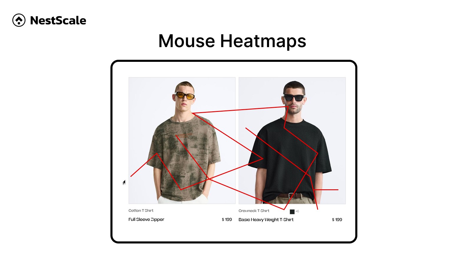
A mouse movement map records the path of a user mouse cursor as they navigate your desktop site.
Because eye movement naturally aligns closely with mouse movement, this map is used to see which text blocks, value propositions, or lifestyle photos are drawing real visual attention and keeping users engaged as they read your content.
3. Important Steps to Analyze Heatmaps for CRO
To get the highest conversion rate optimization (CRO) returns, you should shift your focus away from abstract data and toward direct business solutions, which helps you convert traffic into sales.
3.1. Identify your highest-traffic pages
Do not waste your time reviewing every single page on your store. Focus exclusively on the pages that directly impact your revenue.
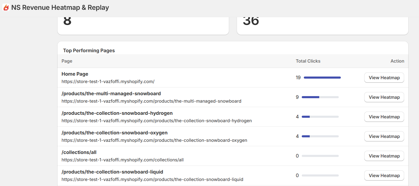
Start with your homepage, your top three highest selling product pages, and your cart page. These high traffic zones give you enough user data to draw accurate conclusions quickly.
When you fix friction points on a high-traffic page, you can yield immediate, noticeable jumps in your clicks and sales.
3.2. Check where users are clicking
You need to verify if your shoppers are actually following the purchasing path you intended for them. Open your click map and look directly at your primary call to action, which is usually your add to cart button. Is it glowing red? If it is a cold blue, you have an immediate visibility or intent problem.
Next, look at what else is getting clicked. If you notice visitors are clicking a secondary promotional banner or a social media icon way more than your purchase button, you can instantly remove or downplay those distractions to guide buyers back to the checkout.
You can identify patterns to improve add to cart rate:
- CTAs that attract more clicks than the others
- CTAs that are hard to find, or are ignored by users
- Areas that are being clicked but does not contain any links or new information pop-up
💡 Not all red areas means conversions, they can be non-converting distractions or dead clicks. Specific CRO heatmaps like NS Revenue Heatmap automatically display conversion metrics for both click and scroll maps, so you don’t make the mistake of solely relying on heatmap colors.
3.3. Pinpoint “Dead Clicks”
A dead click happens when a buyer taps or clicks on something that is not a link, expecting an action to occur. This usually happens with product feature badges, fabric material icons, or unlinked lifestyle images.
Look for intense red or orange clusters over non-converting elements such as plain text. If your heat map shows hundreds of buyers trying to click a static text or design feature, you can satisfy their curiosity and build instant trust by turning that asset into a helpful text link, an informational pop-up, or a direct link to relevant documentation.
Of course, sometimes it can be bots clicking to confuse you. Look closely at the distribution of the clicks. Human curiosity tends to leave somewhat scattered, organic clusters. Bot traffic, on the other hand, often records clicks at the exact same pixel coordinates repeatedly, creating an unnaturally sharp, pinpoint dot.
3.4. Find the drop-off point on your product pages
Switch over to your scroll map to analyze your page real estate. Look for sharp color changes.
If your page turns from bright red to blue over a span of just a few pixels, you have a sharp drop off point. This reveals hidden layout issues such as a “false bottom,” where a large pocket of blank space mistakenly signals to the customer that the page has reached its end.
On the other hand, it can simply means you are not putting relevant information on top of the product page, causing lost of interest.
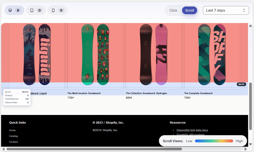
By fixing this visual formatting and ensuring trust signals are being seen, you naturally keep shoppers engaged longer.
3.5. Verify if key information is being read
Every product has a conversion catalyst, such as a sizing chart, a clear return policy, or a block of verified customer reviews. Locate these items on your scroll map.
If your scroll map proves that your target audience leaves the page before reaching these essential informational blocks, you instantly discover a major gap in your presentation. Moving those high-value trust signals and answers to common buying objections higher up into the primary viewing zone removes user hesitation and prevents abandonment caused by lingering doubts.
3.6. Compare intent between desktop and mobile users
Desktop and mobile shoppers live in completely different browsing environments. One can have smooth experiences, yet the others can go through frictions specific to their device.
Toggling between both device views ensures you catch device-specific layout bugs and visibility issues that are actively tanking your mobile conversion rates. It lets you optimize a clean, responsive mobile interface, adapting elements like button sizes, font legibility, and menu layouts to match the rapid scrolling habits of smartphone buyers.
3.7. Form a simple fix-it list
Once your visual analysis is complete, write a prioritized checklist of changes. Without a structured, prioritized checklist of changes, you risk getting overwhelmed by the sheer volume of heat map color overlays and failing to execute any meaningful updates.
You can run small, controlled optimization experiments one at a time and clearly track which specific tweak directly boosts your bottom line.
4. Common Mistakes to Avoid When Interpreting Heat Maps
Data can be misleading if you do not follow a disciplined approach. Avoid these common traps to ensure your store updates yield positive financial results.
4.1. Looking at too little traffic data
Trying to analyze low-traffic pages will waste your time and lead to false conclusions. If a page only gets 15 visits a month, its heat map will look like a scattered, meaningless collection of dots.
You should wait until a page accumulates at least 100 to 200 unique user sessions before drawing conclusions.
4.2. Ignoring the difference between mobile and desktop
Grouping all your user data into a single view creates massive blind spots. Mobile users tap with their thumbs and scroll rapidly, while desktop users move precise mouse pointers and browse deliberately. Always separate your views so you do not apply a desktop fix to a mobile user experience problem.
4.3. Making massive changes all at once
If your heat map reveals three dead links and a poorly positioned button, do not redesign your entire page overnight. If you change everything simultaneously, you will never know which specific adjustment boosted your sales or which one made your performance worse.
Run A/B tests for small changes, wait for new data, and then move to the nex.
4.4. Forget to check with revenue data
A bright red spot means an area is popular, but popularity does not always equal profitability.
For example, a funny product video might get hundreds of clicks and hover time, but if the people watching it leave without purchasing, that element is a distraction. Always ensure your hot spots align with your ultimate goal of generating orders.
FAQs about Website Heatmaps
A heatmap is a data visualization tool that uses color coding to represent activity level. In ecommerce, it is primarily used to track and analyze user behavior; showing where users click or scroll on website.
No, modern heat map tracking tools use asynchronous scripts. This technical method allows the tracking script to load quietly in the background only after your main store images, text, and cart buttons have completely loaded for the user. It will not hurt your search engine rankings or create lag for your shoppers.
Yes, you absolutely can. Even if your store has low order volume, your total traffic patterns on landing pages still provide critical early clues. If you get 300 visitors a week but zero sales, your scroll maps and click maps will quickly reveal where those 300 people lose interest and abandon your store before completing a purchase.
The best approach is to run them during specific high stakes windows. Turn them on whenever you launch a brand new product page design, when you are running a major seasonal promotion, or once every quarter as a routine store checkup to make sure customer navigation patterns remain healthy.