


 Shopify Development
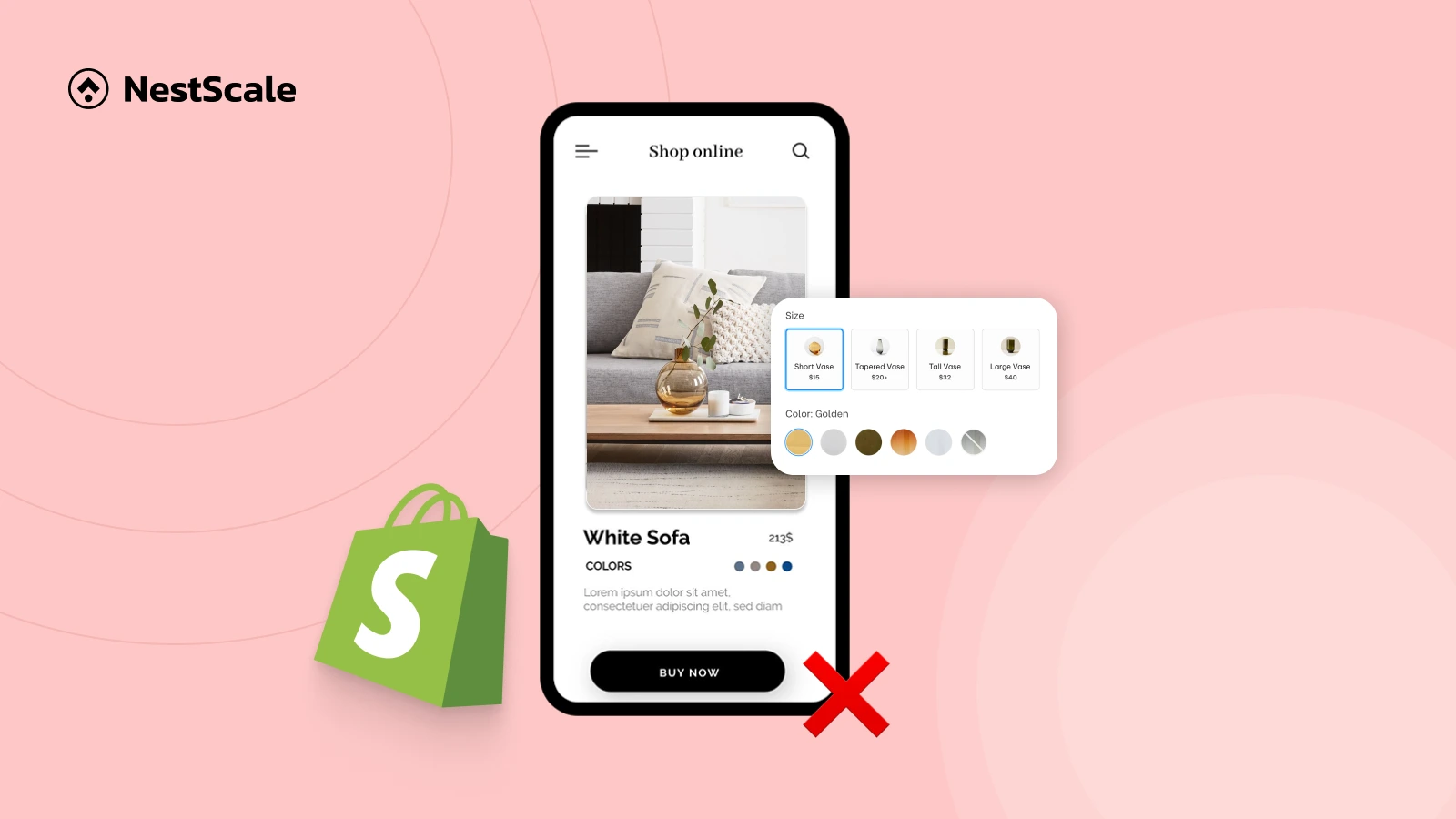
Having variant images fail to display on mobile can be frustrating, not just for store owners, but for shoppers too. And in the mobile-first world of e-commerce, that’s a serious problem. A glitchy product page experience can reduce trust, increase bounce rates, and ultimately hurt your sales.
In this blog, we’ll walk you through the most common reasons your variant images might not be showing on mobile, and more importantly, how to fix them fast. Whether you’re using Shopify, these tips are designed to be practical and easy to apply.
Why Are My Variant Images Not Displaying on Mobile?
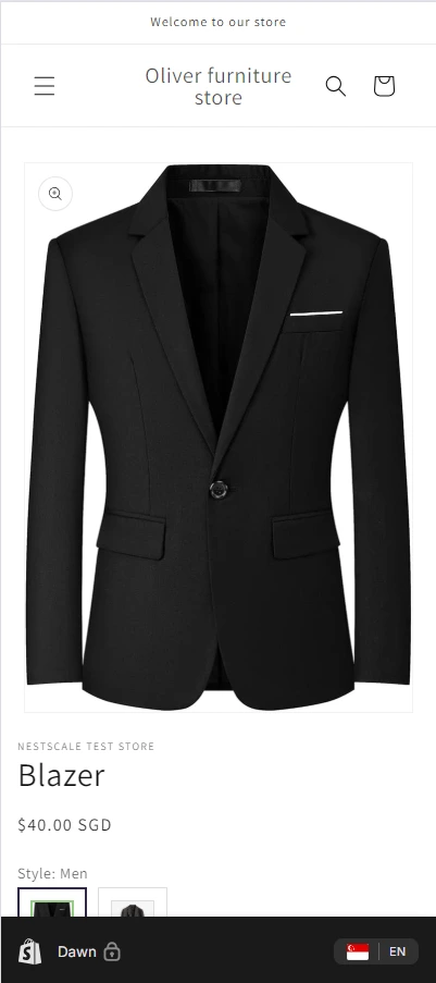
1. Improper Variant Image Assignments in Admin Dashboard
If product variants (e.g., color or size) don’t have images explicitly linked in your e-commerce backend, the store has no visual to render when that variant is selected, especially on mobile, where space and logic are limited.
On most platforms like Shopify, variant images must be assigned to each variant ID. Without this mapping, image-switching scripts don’t execute correctly.
Examples:
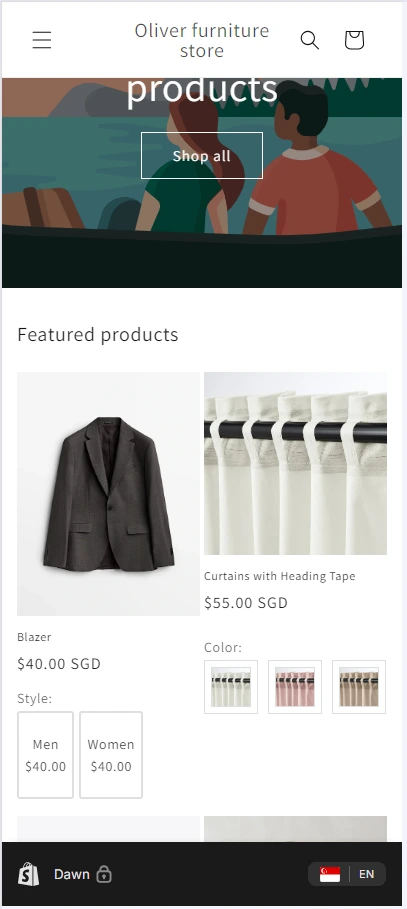
- A “Red Shirt” variant is selected, but no image is assigned, mobile view shows a blank or default image.
- In collection pages using image swatches, unassigned variants won’t update the featured image.
2. Non-Responsive or Outdated Themes
Older or poorly-coded themes often lack responsive design principles. If variant image switching relies on scripts that don’t adapt to mobile layouts, the result is broken interactions or missing images.
JavaScript events may not bind to mobile-rendered swatches due to differences in DOM structure or touch input handling. Some themes don’t include conditional breakpoints for mobile rendering.
Examples:
- Image switching works on desktop hover but not on mobile tap.
- Mobile preview shows incorrect image stacking or nothing at all.
3. Unsupported Image Formats or File Size Limitations
Large or improperly formatted images can fail to load on mobile browsers due to slower connections or compatibility issues.
Mobile browsers have more limited memory and stricter format support (e.g., older Safari not fully supporting WebP). If images are too large, they may timeout or not render.
Examples:
- 4MB PNG image not showing on mobile with 3G connection
- WebP images not rendering on iOS 13 Safari
4. Browser Cache or CDN-Related Issues
Mobile browsers and CDNs aggressively cache images and scripts. When updates are made to variant images or logic, mobile may still serve outdated content.
Caching headers like Cache-Control and CDN layers (e.g., Cloudflare) may not invalidate image paths immediately, causing stale files to load.
Examples:
- You changed a variant image, but mobile still shows the old one
- Clearing cache fixes the issue temporarily
How to Make Sure Variant Images Show Up on Mobile
Troubleshoot Swatch and Image Functionality with NS Color Swatch Variant Images
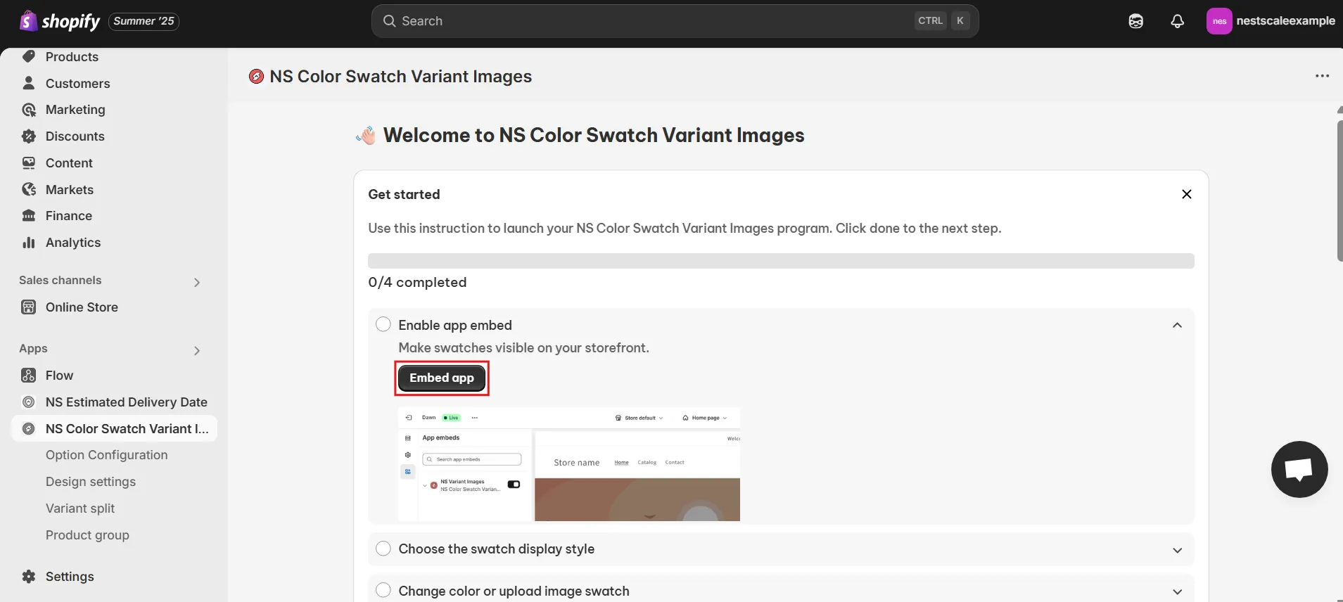
1. Install the App from the Shopify App Store.
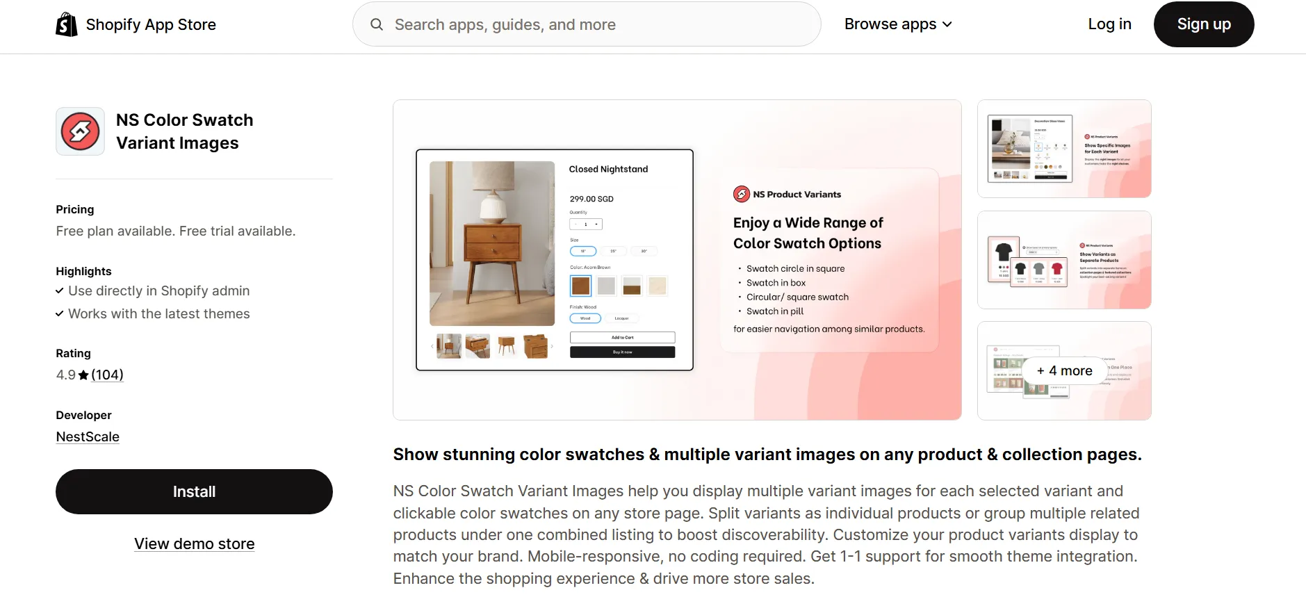
2. Embed It on your product pages with the guided setup.
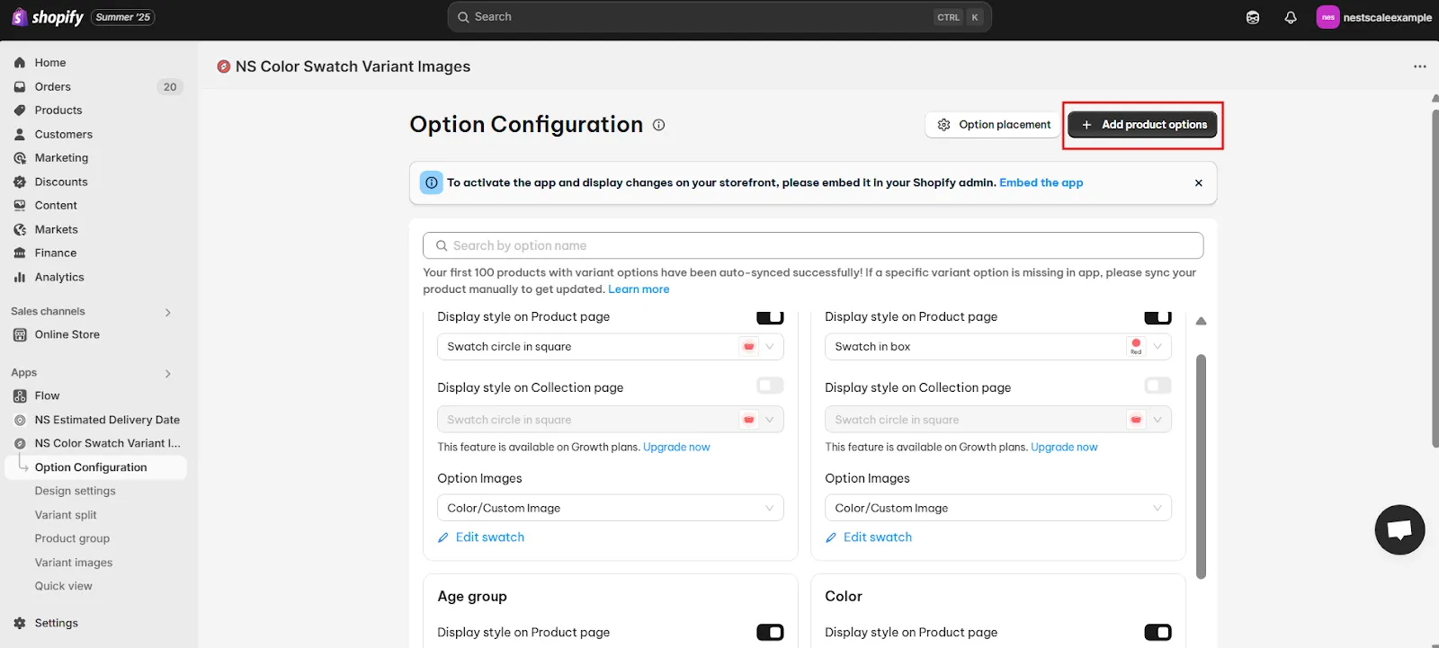
3. Configure Your Swatch Types – color, image, or text options.
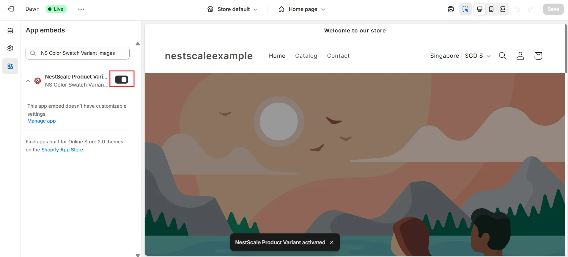
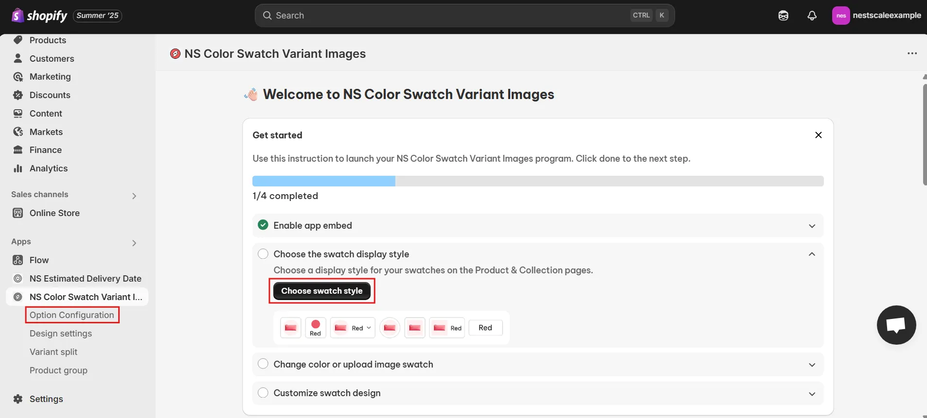
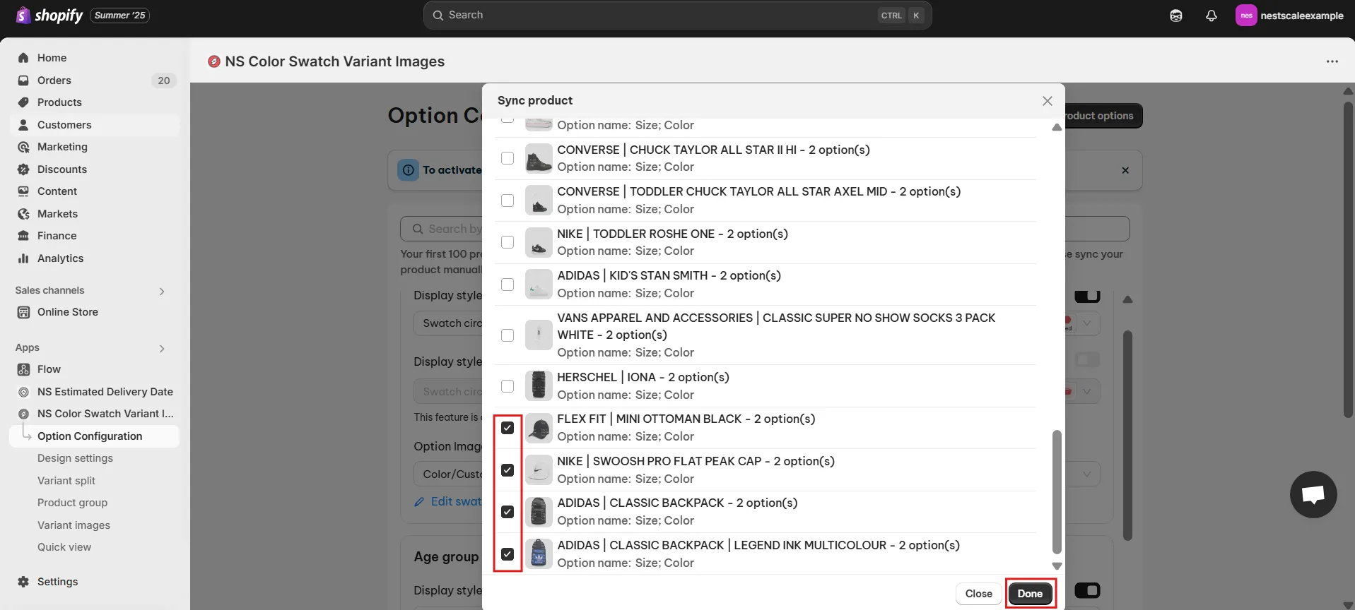
4. Assign Variant Images manually or auto-sync them with the app.
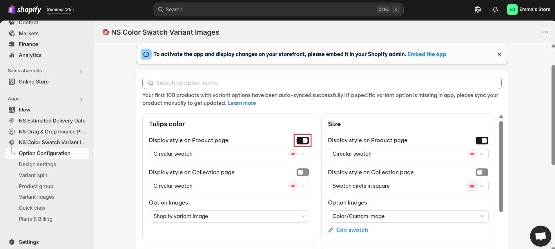
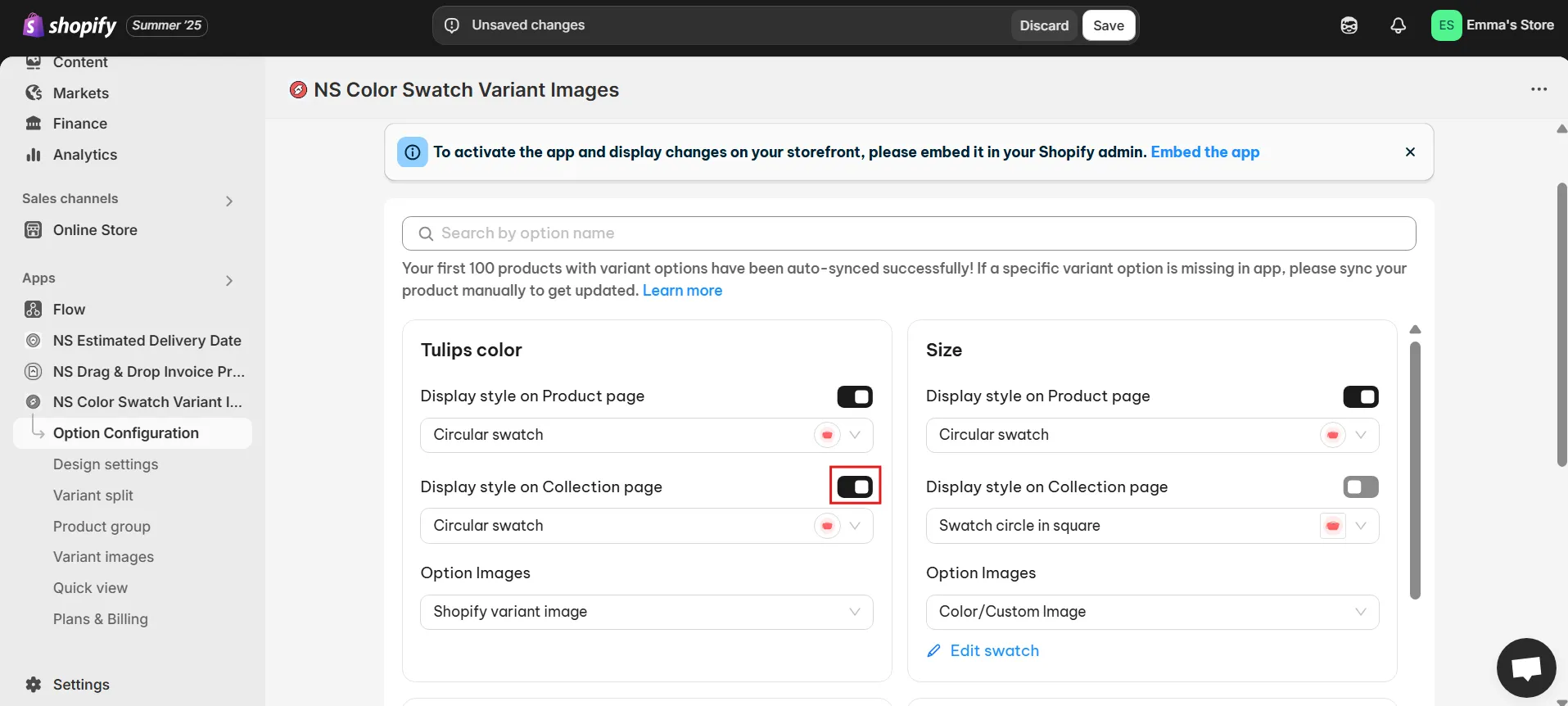
5. Test on Mobile Devices – it’s fully responsive by design.
6. Enhance UX with optional features like:
- Translated variant labels
- Showing variants on collection pages
- Quick-view popups for faster product exploration
Best Practices:
- Avoid mixing multiple swatch solutions.
- Use apps that offer fallback image handling and responsive logic.
💡 Even if a variant doesn’t have its own images, the app uses a fallback gallery system to ensure there’s always something displayed—maintaining a professional look and reducing buyer hesitation.
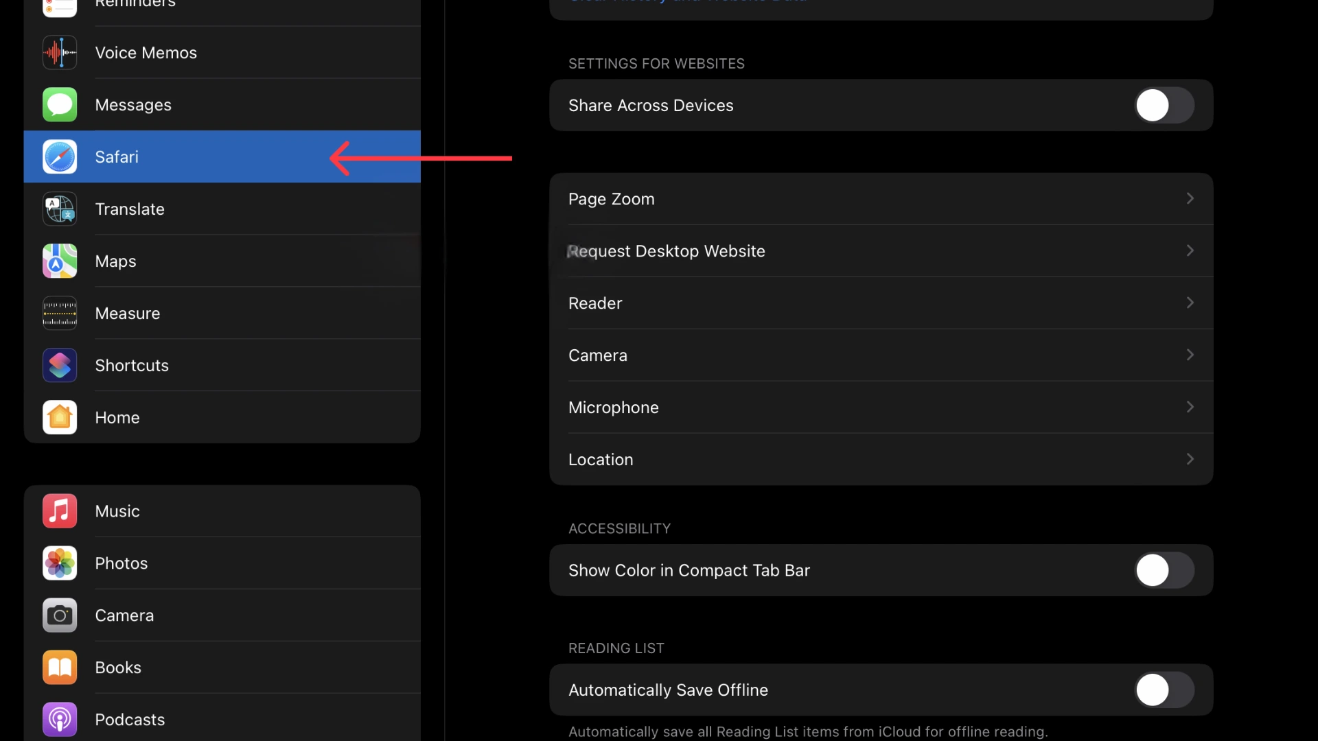
Check Your Theme’s Mobile Support
Let’s walk through the process step-by-step so you can set it up with ease.
1. Open your Shopify store in Google Chrome.
2. Right-click anywhere on the page → click Inspect (or press Ctrl+Shift+I).
3. Click the Toggle device toolbar (or press Ctrl+Shift+M) to switch to mobile view.
4. On the product page, select a variant and observe whether the image updates properly.
5. If images do not change:
- Review your theme documentation for mobile image switching support.
- Update your theme to the latest version.
- Or switch to a fully mobile-optimized theme like Dawn.
Best practices:
- Choose themes that are responsive and support touch-based interactions
- Look for themes that comply with WCAG (accessibility) guidelines.
Clear Cache and Test Across Devices
Here’s a simple step-by-step guide to help you get started.
1. Clear Your Mobile Browser Cache
*On iPhone (Safari)
1. Go to Settings > Safari
2. Tap Clear History and Website Data
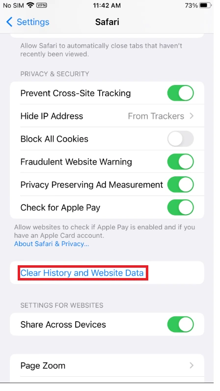
3. Confirm action
*On Android (Chrome)
- Open Chrome
- Tap 3 dots (top-right) > History > Clear browsing data
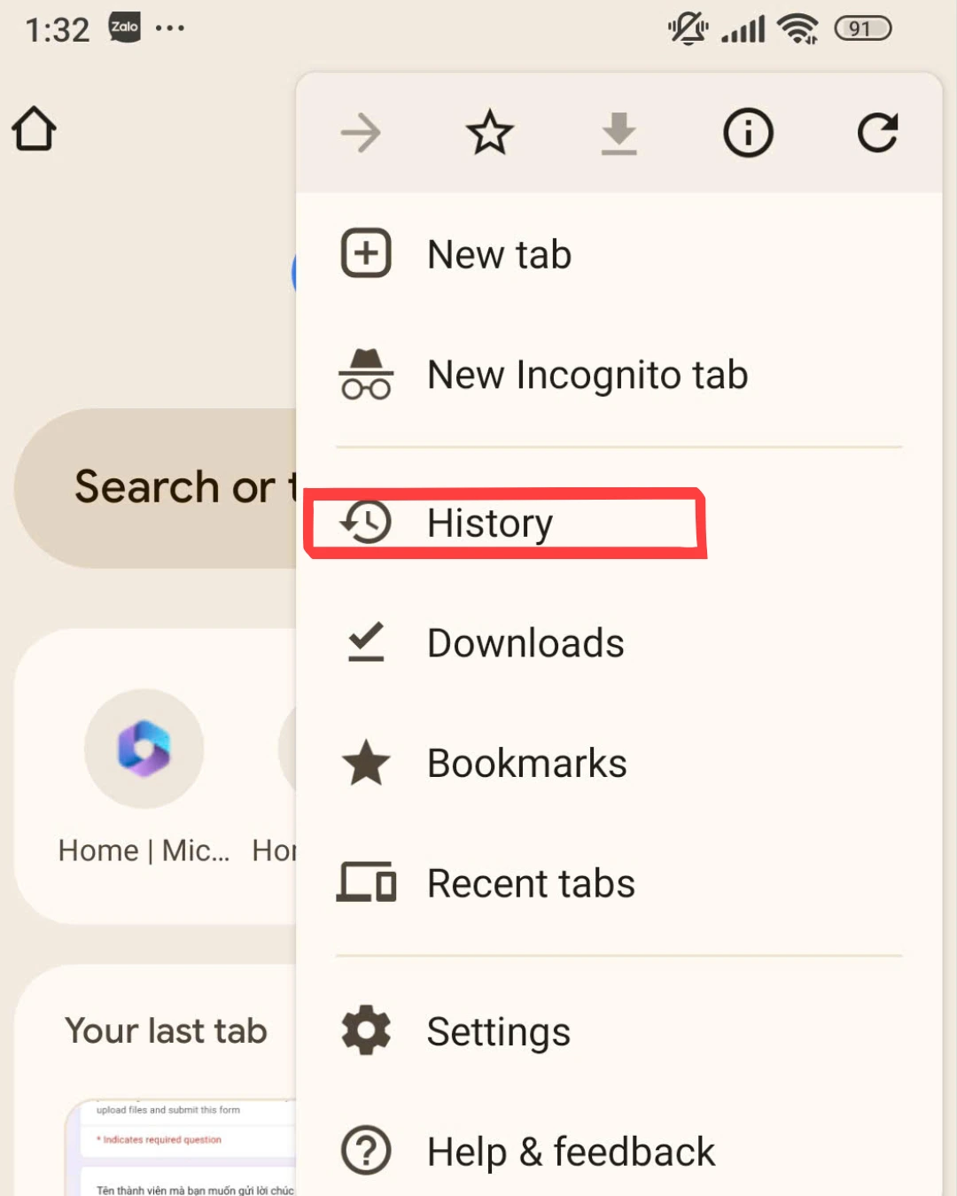
- Select Cached images and files, then tap Clear data
2. Open the Site in Private/Incognito Mode
This is the easiest way to simulate a first-time visitor experience:
- Chrome: Ctrl+Shift+N (Windows) or ⌘+Shift+N (Mac)
- Safari: File > New Private Window
Then navigate to your product page and:
- Select a variant
- Check whether the image changes as expected
Optimize Image Files for Mobile
Now, follow these steps to set everything up smoothly.
- Use image compression tools: TinyPNG, ImageOptim
- Stick to JPEG (compressed) or WebP (if widely supported).
- Ensure images are:
- <500 KB in size
- 800–1200 px width
- Optimized for lazy loading or responsive display
Best Practices:
- Use srcset to serve different image sizes based on device resolution.
- Host images on reliable CDNs with fast delivery for global users.
FAQs
Could apps or custom code prevent variant images from showing on mobile?
Absolutely. Some third-party apps override product image scripts or conflict with theme logic. Try temporarily disabling those apps or reviewing any recent custom code changes. If you’re using NS Color Swatch Variant Images, it’s designed to be lightweight and conflict-free, but you should still disable any overlapping swatch/image apps to avoid interference.
Why are my variant images visible on desktop but not showing on mobile?
This issue is often caused by mobile-specific theme settings or CSS rules that hide or limit image display on smaller screens. Some Shopify themes may apply different logic for mobile, like hiding large images or using lazy loading improperly. So, we recommend using a variant image app like NS Color Swatch Variant Images to prevent this issue. That’s because your swatch layout has already been configured to display properly on all mobile devices when using the app, and if it doesn’t, you can call for our support anytime.


 Marketing Attribution
  Google Advertising
  Facebook Advertising