


This guide walks you through the most common problems Shopify merchants face when trying to increase the size of their color swatches, and how to fix them without breaking your layout or losing image quality. We’ll cover how you can:
- Make swatches larger and more visible
- Prevent layout issues when resizing
- Fix text overflow or crooked alignment
- Avoid blurry or pixelated swatch images when enlarging them
It’s time to resize swatches safely and keep them looking sharp across your product and collection pages.
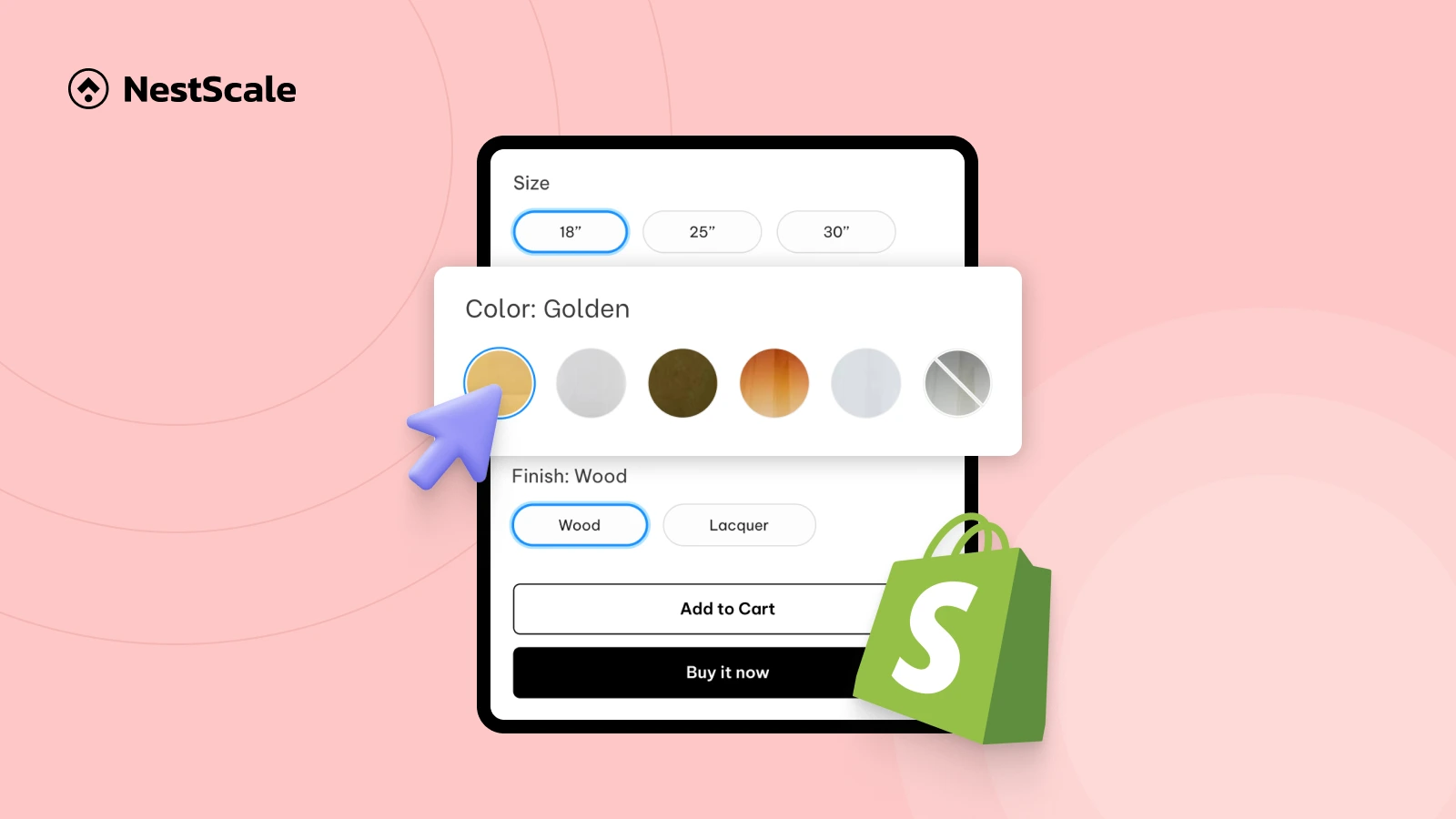
Step 1: Resize your swatches with NS Color Swatch Variant Images
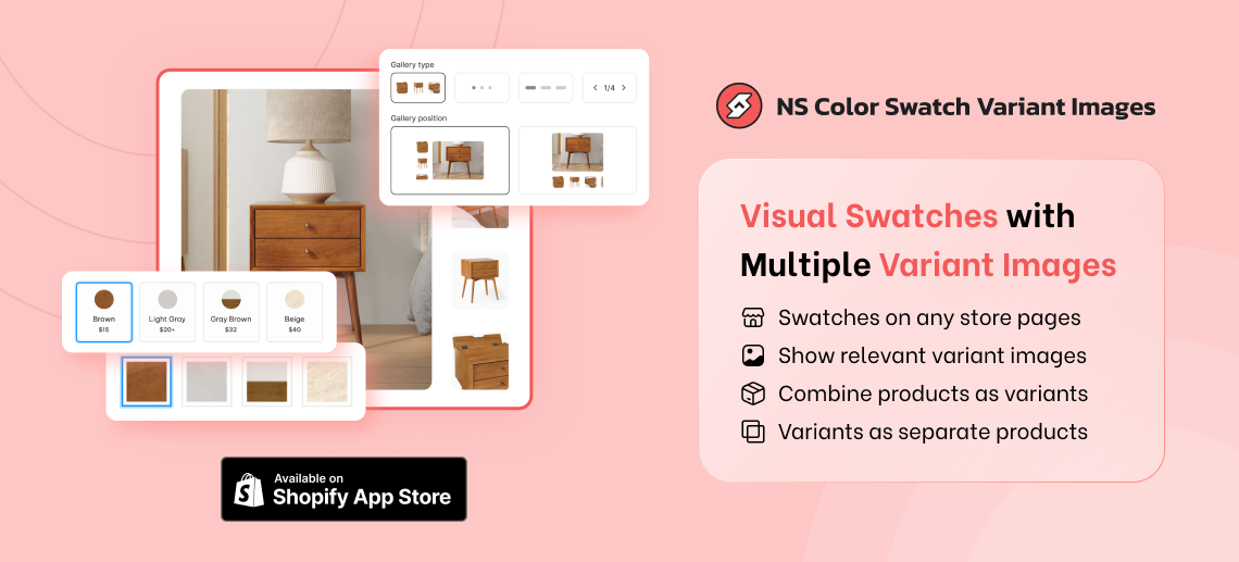
First, you need to install NS Color Swatch Variant Images. We built this tool to help Shopify merchants customize color swatches and variant images easily without any coding experience.
Once you’ve installed the app, open it and get started!
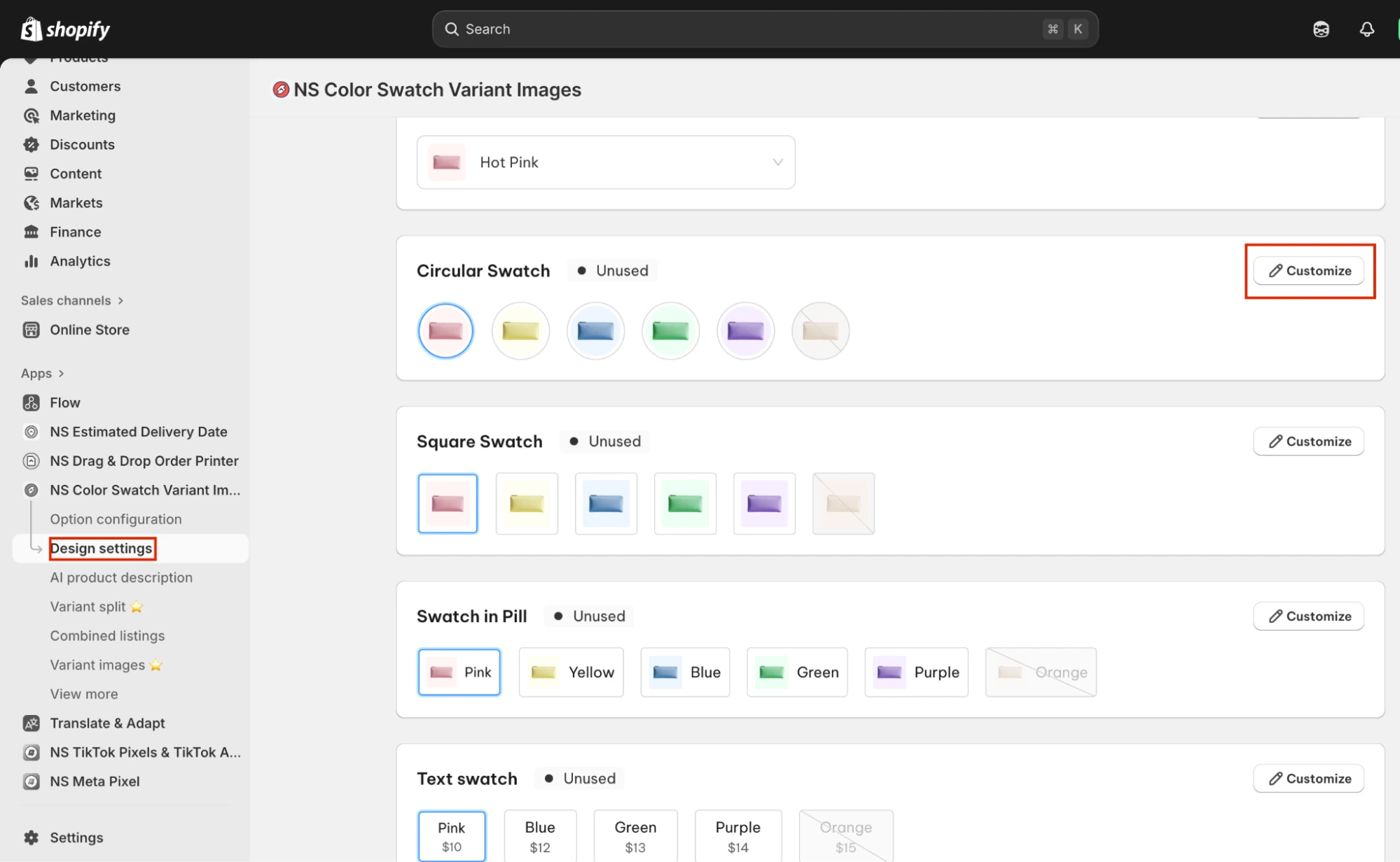
1. From the sidebar, go to Design Settings.
2. You’ll see a list of swatch styles, find the one you want to use for your swatches, and click Customize.
*You can customize all or some of these swatch styles and use multiples of them for your different options later when applying them to your products.
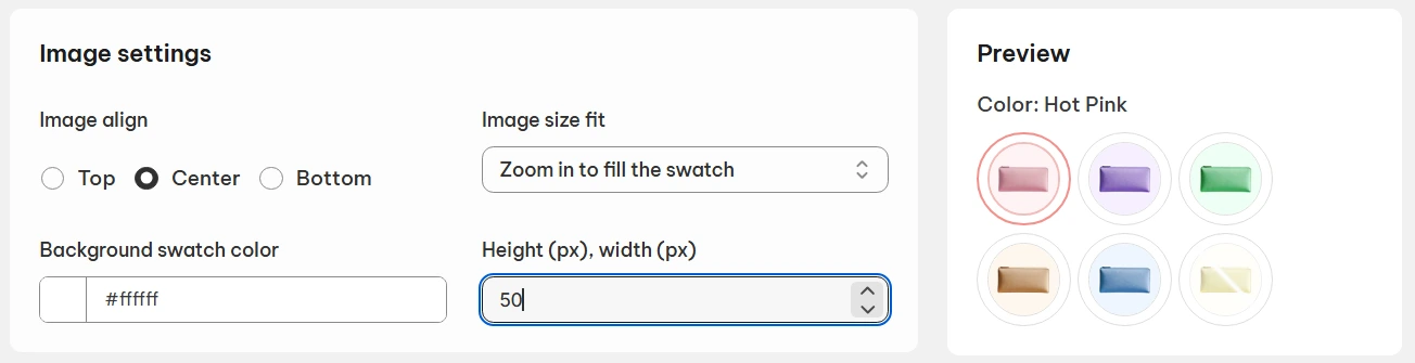
3. Scroll to the Image Settings section.
4. Adjust the width and height to make your swatches larger or smaller as needed.
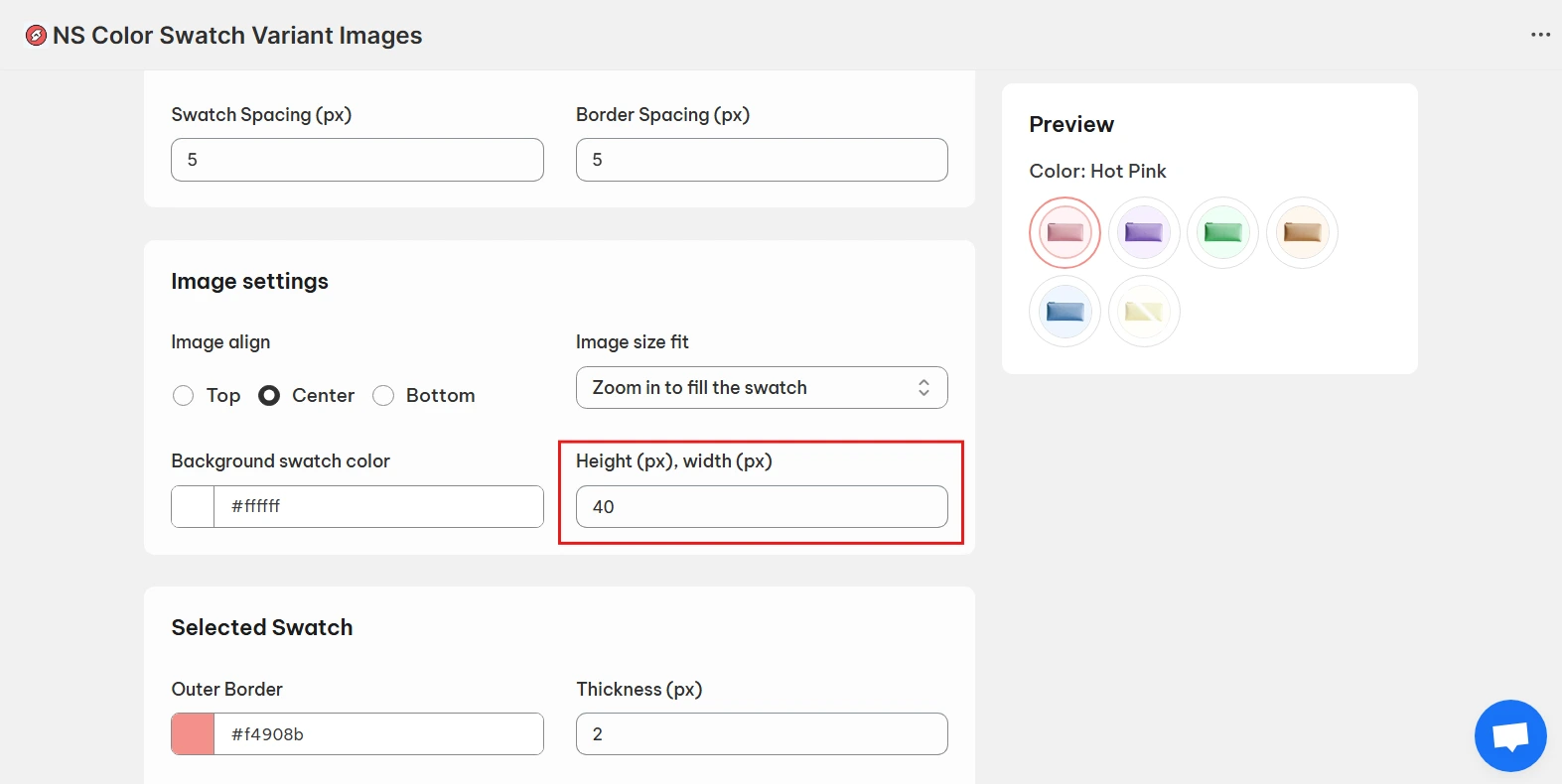
Use the live preview on the right-hand side to make sure everything looks neat and aligned.
Step 2: Control the layout of your swatches
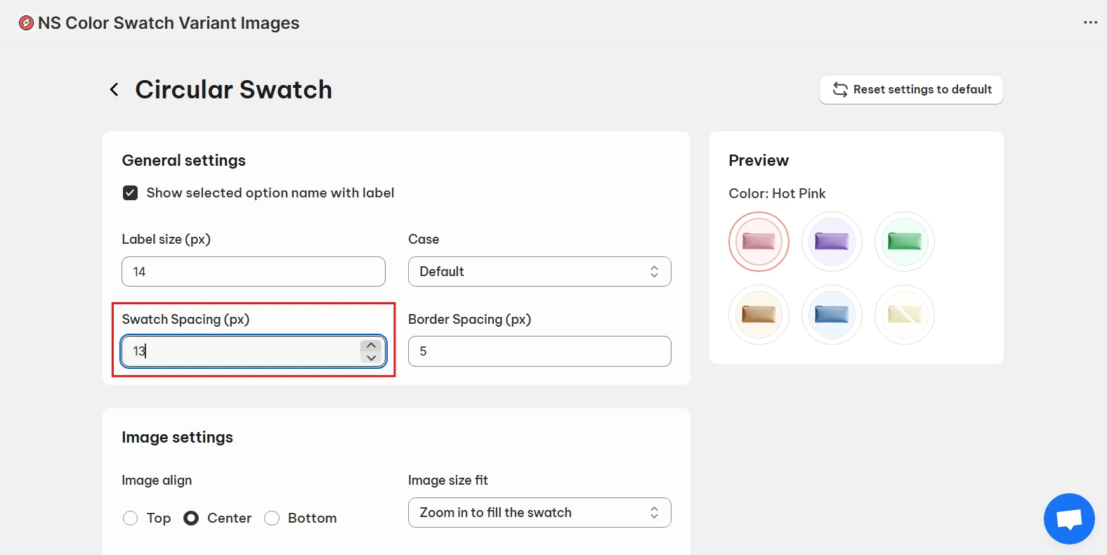
When you enlarge your swatches, the spacing between them can start to feel tight. Let’s fix that.
1. Increase the swatch spacing to create more breathing room.
This keeps your layout balanced and visually appealing.
While you’re in the design settings, take advantage of other customization tools to tweak your swatch look:
- Variant label: Adjust or show variant names under swatches.
- Swatch border: Refine border size and color for a polished finish.
- Shadow: Add depth to make your swatches pop.
- Tooltip: Show color or variant names on hover.
- Zoom on hover: Let shoppers see pattern details more clearly.
Once you’re happy with the design, click Save to apply your changes.
Step 3: Activate & display swatches on your Shopify store
Now that your swatches are resized and customized, it’s time to make them live on your Shopify storefront.
1. Go back to the app’s main dashboard and follow the Get Started steps. Start by embedding the app.

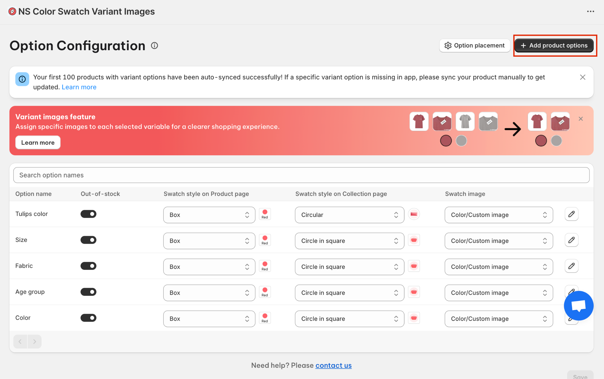
2. Head to Option Configuration, the app automatically syncs options from your latest 100 products here.
If an option is missing, click Add Product Options (top-right corner) and manually add it.
Here are some main functionalities in this dashboard:
- Swatch style on Product page: Choose a display style on the product page for the aligned option swatches.
- Swatch style on Collection page: Choose a display style on the collection page for the aligned option swatches.
- Swatch image: (1) Use variant images you set in the Shopify admin for your swatches OR (2) Upload custom variant images from your computer. *Click into the pencil to upload your images*
- Out-of-stock button: Toggle it on to hide sold-out variant swatches.
You can go to Design Settings to customize the swatch style further (Like we’ve just resized them in previous steps).
3. Save changes and now the swatches are active on your storefront.
FAQs
Why do my swatches look blurry after increasing their size?
Blurry swatches usually happen because the original variant images are low-resolution. When you increase the swatch size, the app simply stretches the image, so any image that’s too small will naturally look pixelated.
How to fix it: Make sure your variant images are uploaded in high quality before enlarging your swatches. A good rule of thumb is to use images that are at least 500 × 500 px so they stay crisp even when resized.
What’s the ideal size for color swatches on Shopify?
There’s no one perfect size for every store, but most Shopify merchants find a sweet spot between:
- 28-40 px for clean, minimal layouts
- 40-55 px if you sell products where color or texture matters (fashion, home decor, cosmetics, flooring, etc.)
The best size depends on your theme design, spacing, and how much detail you want customers to see. Start small, increase gradually, and check the preview to make sure your swatches don’t overpower other elements on the product page.
How to avoid text labels overflowing from swatches?
If your text labels are spilling out of your swatches, it typically means the swatch style isn’t designed for long text. To avoid this, you should use swatch styles that are optimized specifically for text in NS Color Swatch Variant Images, such as: Dropdown, pill, text button.
These styles are built in a way that automatically adjusts spacing, padding, and alignment, so your labels stay readable and visually neat without any manual CSS.