For all eCommerce businesses, running a highly responsive website with many great features means your customers will love everything when viewing your site. A good website applies the first impression on every customer, benefits SEO, and builds trust and loyalty. Most importantly, it provides customers with a good and consistent experience.
However, not all online businesses realize that their website with many annoying features are making them lose many potential customers. Therefore, in this article, we will showcase the top 5 annoying features on your website that you need to avoid, also there are some tips to improve its performance. Let’s dive in immediately
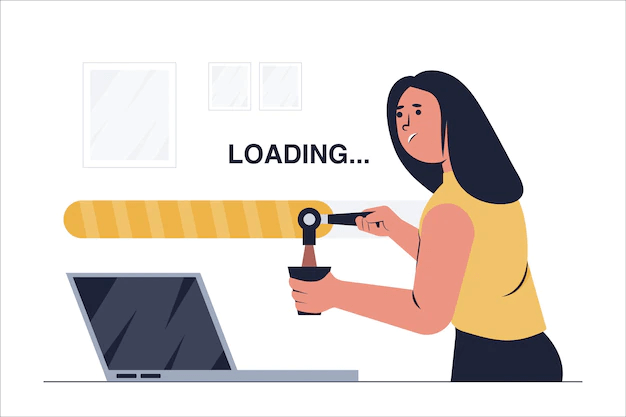
Long time loading
A website with a slow loading speed must have a negative impact on the customer journey. It reduces customer engagement with the brand and the time that users spend surfing your website. Furthermore, a slow loading speed can increase the number of shopping cart abandonment and higher bounce rate.
There are some reasons why your site is loading so slowly. Too many HTTP requests, unsuitable catching techniques, files, images, videos, and much more. Anything such as these elements to the speed of the server that hosted your website can affect the loading speed.
40% of people abandon a website that takes longer than 3 seconds to load. Remember, the longer customers spend waiting for your site to load, the higher chance they turn into your rival’s customers.
Poor customer service
When customers visit a bad website with poor customer service, they have to go through many pages and steps to find customer service information. If they can’t find the contact of your service, there will be a higher chance that you will lose them to your competitors. In fact, 22% of customers abandon their carts because of unreachable customer service, when they need to ask questions about checking out.
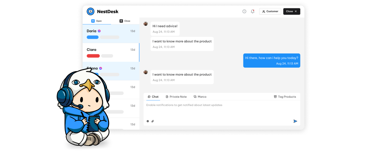
To solve the problem, you can create a “Contact us” page where customers can easily send questions to your support team. Or you can use helpdesk software like NestDesk to create a simple live chat icon on your website so that customers can easily reach out to you. Moreover, NestDesk will help you improve the overall performance of your customer service team on every sales channel.
Unable to read text
The readability of your website decides how easily customers can read content and get your idea clearly. It is important because most website visitors don’t have much time to learn fully about your company, products, and services. They want to quickly find and understand the information that they are looking for.
A website’s readability can be affected by some reasons that you need to remember. They are color contrast, white space, line spacing, font style, font size, text width, headings, graphics, and animation. Try to optimize the text on websites to provide your customers with a better experience. By providing an easy-to-read site, you can save a lot of customer time and money, and give them more value.
Unlogic hierarchy
The statistics show that 95% of visitors will leave your site immediately if it is difficult to navigate. Therefore, a clear and concise website structure is important to your online business. It can improve the friendliness of your website and customer experience by making it easier for customers to find what they are looking for.
A cluttered layout, inconvenient navigation menu, lack of color contrast, non-responsive design, and inconsistent typefaces are the things you need to avoid. To make your website a better structure, you should consider these steps:
- Research your competitor’s website: Identify how they are building their websites, how they organize them, how many categories they have, and how these categories are linked. Also, you can see if there is anything that you can do better than them.
- Categorize your pages: Your categories need to be clear, understandable and look like a map to show customers where they go on your website.
- Connect pages with clear internal links: Good internal links allow Google crawlers to find all the contents and information you provide on your site. Your pages should have 2 types of internal links, one link tells your customers where pages are pointing, and one link tells customers where your page is coming from. should build your pages to have links that point to it and come from it.
- Build clear and concise navigation: There is much navigation that you can choose to apply on your site. Menu, breadcrumbs, header, footer, filtering and sorting, tags, and linking blocks are 7 options for you to choose from for a website. Remember to consider and test your navigation appearance on mobile devices.
- Test and improve your website: Before you launch your website, you should ask colleagues or friends to have a better idea of your structure. Besides, there are many tools for you to check your page performance, or Google Search Console to see how Googlebot sees your pages. You can also ask your customers if there is anything that needs improvement on your sites.
Complicated checkout process
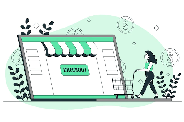
87% of online shoppers leave their carts if their checkout process is too long or complicated. This is considered an obstacle in their journey as they cannot make purchases quickly, their desire soon turns into disappointing emotion and they lose customers.
Although the checkout process can provide you with many customer information, or their account used to login to your website. Do not overuse. Having a convenient and quick checkout can satisfy your customer more than you imagine.
To make your checkout process more convenient for customers, do not require them to log in before checking out. Instead, have the option to allow them to checkout as guests. Besides, do not ask for too much information when checking out; only ask for the data you need to complete customer orders. Or you can use a customer service solution, like NestDesk, to shorten the buying process and win customers faster. With the order creation feature, you can easily create draft orders and share the checkout link with your customers to finish the checkout process.
Not mobile-friendly
A mobile-unfriendly website can be very difficult to navigate, and it makes you lose potential customers, as well as damage your brand image. On the other hand, having a mobile-responsive website allows customers to easily access it and increases engagement, conversion, and sales. It also allows customers to interact and engage with your brand across all devices without any obstacles.
Your website needs optimizing to be easy to navigate on phone and tablet screens. To do so, you can follow the steps below:
- Use Google’s mobile-friendly tool: You can post your website URL into this tool and see if your site is mobile-friendly or not.
- Use a Responsive WordPress Theme: Your website needs to be rendered properly across all devices, browsers, and screen sizes.
- Avoid using pop-ups: Sometimes, website pop-ups shown on mobile devices can annoy your visitor because the x-mark to close it isn’t displayed. Make sure that your pop-up is shown properly on mobile devices before launching it.
- Test continuously on mobile devices: Through testing, you can detect any problems and quickly find solutions. You should test both before and after launching your website on a mobile device. Consider every case that your customer uses which mobile devices to see your site. By doing so, your customer will have a better experience when browsing on whatever device they use.
Make the website a great place for customers
Building a good website without any annoying features is the first step to having a successful business. Make sure that your online is a great place where customers can easily shop and find useful information.
Want to provide exceptional customer service and also get more sales from every customer touchpoint? Try NestDesk for free now and take a step closer to your business success.


