





1. What is a heatmap?
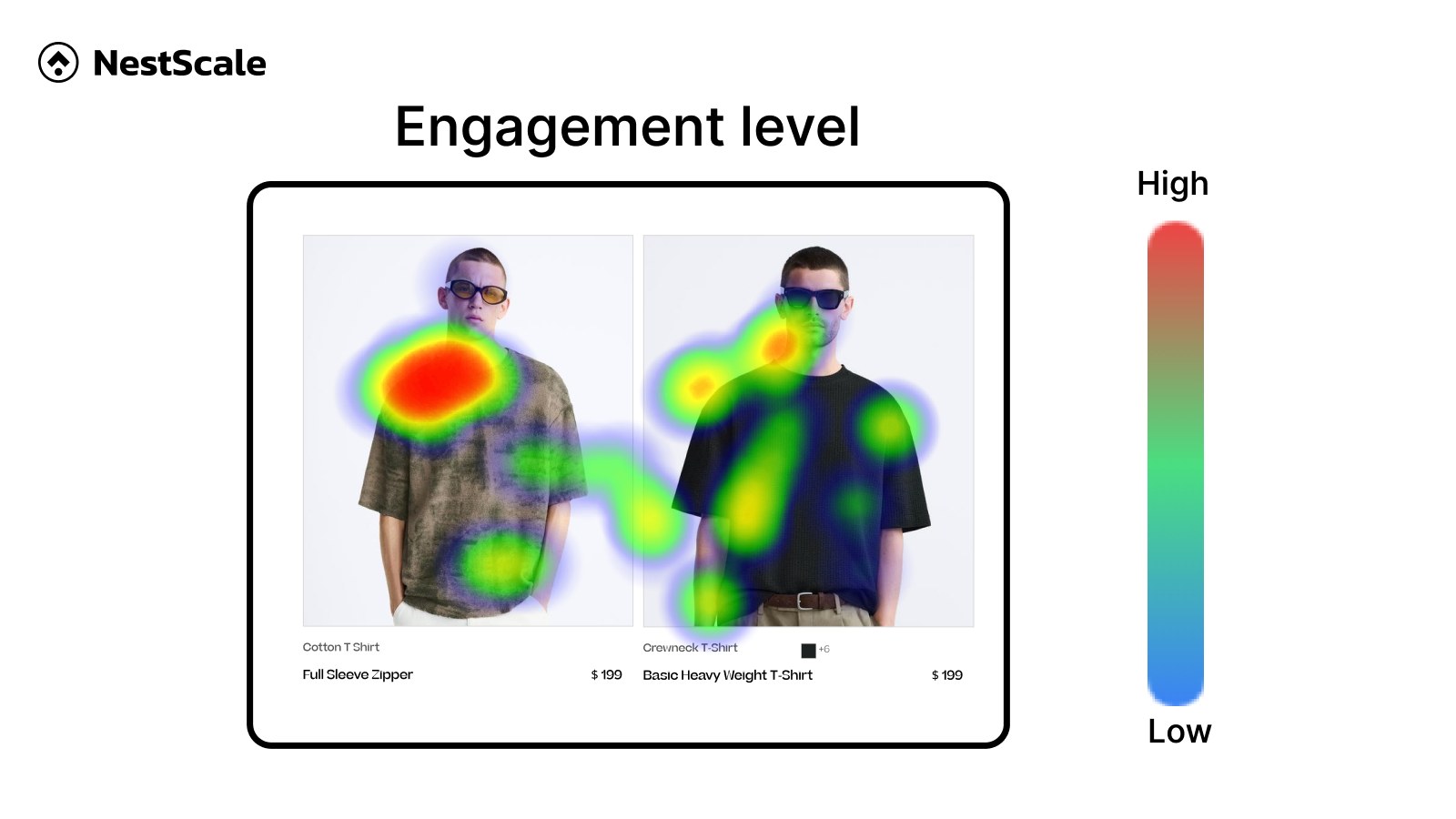
A heatmap is a visual tool that uses color-coding to show how users interact with a webpage, making complex data easy to understand at a glance.
By converting complex numerical datasets (like click counts or scroll depths) into color-coded visual maps, heatmaps make it easy for marketers, UX designers, and product managers to spot behavioral trends.
Typically, warm colors (red and orange) signify high-engagement areas with a lot of activity, while cool colors (blue and green) indicate low-engagement zones that users ignore.
2. Types of website heatmaps
Different types of heatmaps capture different dimensions of user behavior. Depending on your optimization goals, you will use a combination of the following:
2.1. Click maps
Click maps show you exactly where users click (on desktop) or tap (on mobile). They help you identify whether users are clicking your primary call-to-action (CTA) buttons, and conversely, if they are repeatedly clicking non-clickable elements like static images or text headings out of frustration.
2.2. Scroll maps
Scroll maps visualize how far down a page users scroll. This is incredibly valuable for landing page optimization. It reveals the exact point where visitors lose interest and drop off, helping you decide where to place critical information and CTAs so they don’t end up buried “below the fold.”
To make the most out of these maps, you need to learn how to correctly read a heatmap.
2.3. Move maps (Attention maps)
Move maps track where desktop users move and rest their mouse cursor as they navigate a page. Studies show a high correlation between mouse movement and eye movement, meaning move maps function as a cost-effective alternative to traditional eye-tracking hardware to show what captures visual attention.
3. What are the benefits of heatmaps?
Heatmaps are essential for businesses that want to shift from guessing how users interact with their site to making data-driven improvements. Here is why they matter:
- Identify UX roadblocks: Spot design flaws immediately, such as confusing navigation layouts, broken links, or distracting visuals that pull users away from making a purchase.
- Optimize conversion funnels: By combining heatmaps with A/B testing, you can see exactly why a new design performs better or worse by observing how engagement shifts between variations.
- Enhance mobile responsiveness: Since mobile layout structures change significantly compared to desktop, heatmaps let you see if mobile users are struggling to find menus or tap small buttons.
FAQs
Heatmaps are used to improve user experience and optimize conversion rate. They reveal which elements — like CTAs, links, or images —attract attention or cause confusion.
Google Analytics (GA) provides quantitative metrics—the what (e.g., bounce rates, page views, and conversion rates). Heatmaps provide qualitative visual context—the why (e.g., users are bouncing because they never scroll far enough down to see the main product video). They work best when used together.
Most modern heatmap tools use asynchronous loading scripts. This means the tracking script runs independently in the background and will not block your website’s main elements from rendering, resulting in a negligible impact on overall page load speed.
To create a website heatmap, install a heatmap tool. The tool automatically tracks user interactions in the background and provides visual heatmaps.
If you are using Shopify, you can explore some of the best heatmap apps for this platform.